Introduction
benviplot provides color palettes and ggplot2 helper
functions for exploratory data analysis. The color schemes are based on
Benvi, a discontinued brand of the Brazilian proptech QuintoAndar1. The
package ships with a custom ggplot2 theme, a family of discrete and
continuous color scales, and convenience wrappers for common chart
types.
Installation
# Install remotes if needed
install.packages("remotes")

remotes::install_github("viniciusoike/benviplot")
Font Setup (Optional)
benviplot bundles the Poppins font family and registers
it automatically when the package loads (requires the
systemfonts package). When Poppins is registered,
theme_benvi() uses it by default. Without
systemfonts, the theme falls back to the system sans-serif
font.
For the best rendering quality with custom fonts, install the
ragg package. When ragg is set as the graphics
device (the default in RStudio and Positron), Poppins renders correctly
in all output formats.
install.packages("ragg")You can check your full font and device status at any time with:
Quick Start
The core of the package is theme_benvi() combined with
the scale_*_benvi_*() functions. Together, they give any
ggplot2 chart a consistent look with minimal effort. In the example
below, scale_fill_benvi_d() maps the discrete cylinder
variable to the "qual_8" qualitative palette, while
theme_benvi() handles the rest of the styling.
ggplot(mtcars, aes(x = wt, y = mpg, fill = as.factor(cyl))) +
  geom_point(shape = 21, size = 3, color = "#000000") +
  scale_fill_benvi_d(name = "Cylinders", pal_name = "qual_8") +
  labs(
    title = "Fuel Efficiency vs. Weight",
    x = "Weight (1000 lbs)",
    y = "Miles per Gallon"
  ) +
  theme_benvi()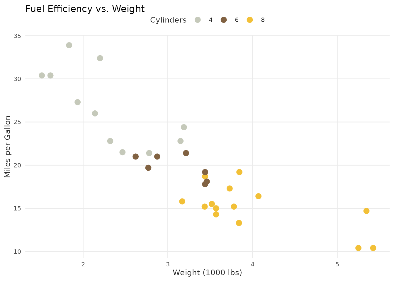
Color Palettes
The package organizes its palettes into several families: theme, sequential, qualitative, diverging, city-specific, and brand. Each family serves a different purpose, and choosing the right one depends on the nature of your variable.
Browsing palettes
show_palettes() gives a visual overview of all available
palettes. Calling it without arguments displays every palette in the
package; pass a type name to narrow the output.
You can filter by type: "theme",
"sequential", "qualitative",
"city", or "brand".
show_palettes("sequential")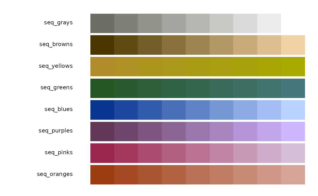
Accessing palette colors
benvi_palette() returns a named vector of hex codes.
Printing it renders a color swatch in the console, which is useful for
quick visual comparison.
# Preview a palette
benvi_palette("qual_2")
#> [1] "#C5C9BA" "#816242" "#F2C037" "#009850" "#466795" "#9A75B4" "#EA4E58"
#> [8] "#C64729"
#> attr(,"class")
#> [1] "palette"
#> attr(,"pal_name")
#> [1] "qual_2"
To use the colors outside of ggplot2 (e.g. in base R or as input to another package), coerce to a plain character vector.
# Get hex codes as a plain character vector
as.character(benvi_palette("benvi_blue"))
#>  [1] "#021841" "#192C50" "#2F405F" "#46546E" "#5D687D" "#737C8C" "#8A919C"
#>  [8] "#A0A5AB" "#B7B9BA" "#CECDC9"
Discrete palettes contain between 4 and 9 fixed colors. When you need
more granularity, set type = "continuous" to interpolate an
arbitrary number of colors along the palette gradient.
benvi_palette("seq_greens", n = 20, type = "continuous")
#>  [1] "#245825" "#255929" "#275A2D" "#295C31" "#2A5D36" "#2C5F3B" "#2E613F"
#>  [8] "#2F6243" "#316448" "#33664C" "#356751" "#376955" "#396B5A" "#3A6C5E"
#> [15] "#3C6E62" "#3E7067" "#3F716C" "#417370" "#437575" "#46777A"
#> attr(,"class")
#> [1] "palette"
#> attr(,"pal_name")
#> [1] "seq_greens"
Using ggplot2 Scales
The scale functions follow the standard ggplot2 naming convention:
scale_{aesthetic}_benvi_{d|c}(), where d is
for discrete variables and c is for continuous ones. Both
color and fill variants are available, and
colour spellings work as expected.
Discrete scales
Discrete scales map categorical variables to a qualitative or
city-specific palette. The pal_name argument (or the first
positional argument) selects which palette to use.
iqaiw_total <- subset(iqaiw, rooms == "Total")

ggplot(iqaiw_total, aes(x = date, y = index, color = name_muni)) +
  geom_line(linewidth = 0.7) +
  geom_hline(yintercept = 100) +
  scale_color_benvi_d("rio_qual", name = NULL) +
  labs(
    title = "IQAIW Rental Index by City",
    x = NULL,
    y = "Index (base = 100)"
  ) +
  theme_benvi()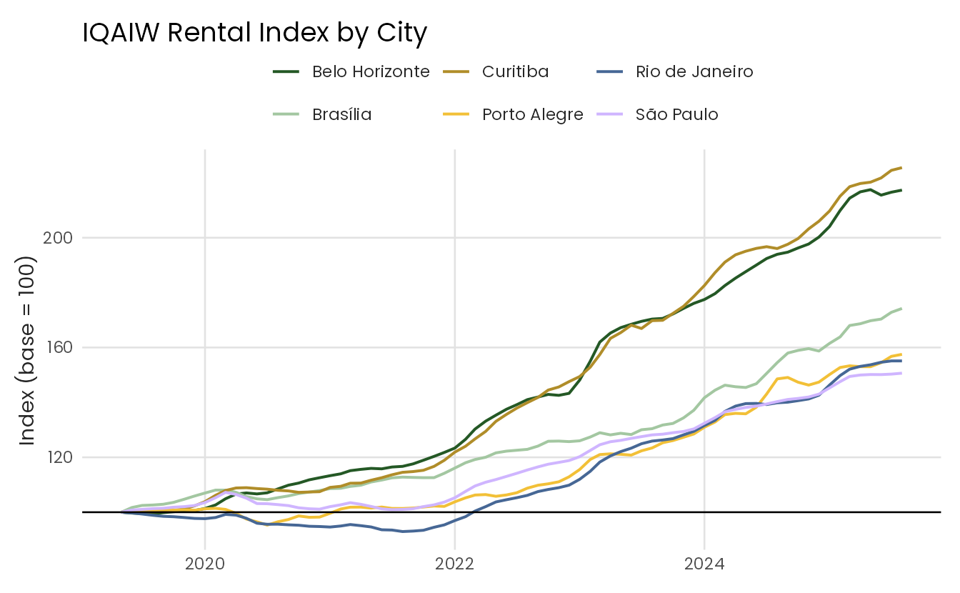
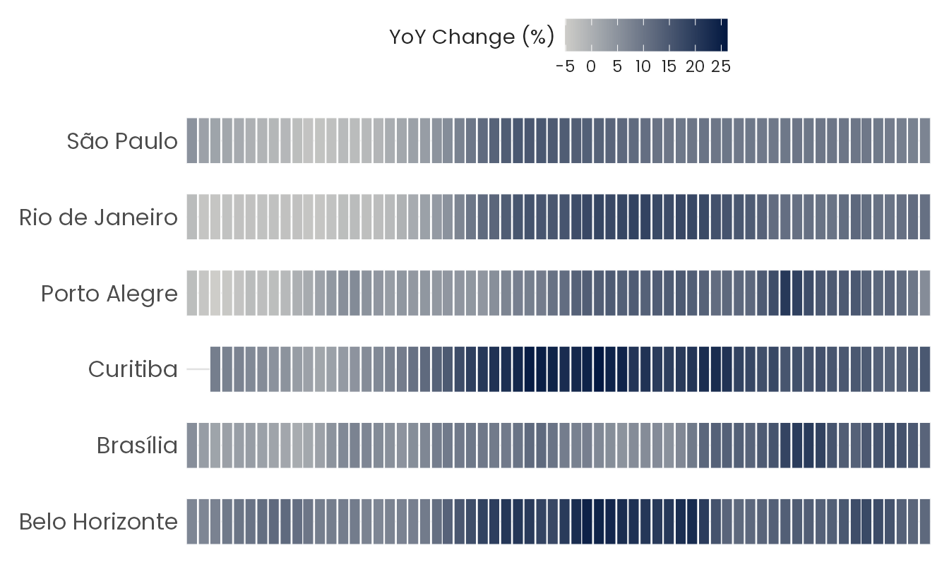
Continuous scales
Continuous scales interpolate across a sequential or brand palette.
They are well suited for heatmaps, choropleths, and any visualization
where a numeric variable needs a smooth color gradient. Use
direction = -1 to reverse the palette.
iqaiw_total <- subset(iqaiw_total, !is.na(acum12m))

ggplot(iqaiw_total, aes(x = date, y = name_muni, fill = acum12m * 100)) +
  geom_tile(height = 0.6, color = "#ffffff") +
  scale_fill_benvi_c(
    pal_name = "benvi_blue",
    name = "YoY Change (%)",
    direction = -1
  ) +
  scale_x_continuous(
    breaks = seq(2023, 2025, 1),
    expand = expansion(0)
  ) +
  labs(x = NULL, y = NULL) +
  theme_benvi() +
  theme(
    legend.title = element_text(hjust = 0.5, vjust = 0.75),
    axis.text = element_text(size = 12),
    panel.grid = element_blank()
  )
Plot Helper Functions
benviplot includes convenience wrappers for common chart
types. These functions accept a data frame and column names via tidy
evaluation, apply theme_benvi() automatically, and return a
standard ggplot2 object. They are designed for quick
exploratory work; for publication-quality figures, building the plot
from scratch gives you full control.
Line chart
plot_line() draws a single-series line chart. Pass
color to map a grouping variable and get multiple lines
with an automatic legend.
plot_line(economics, x = date, y = uempmed)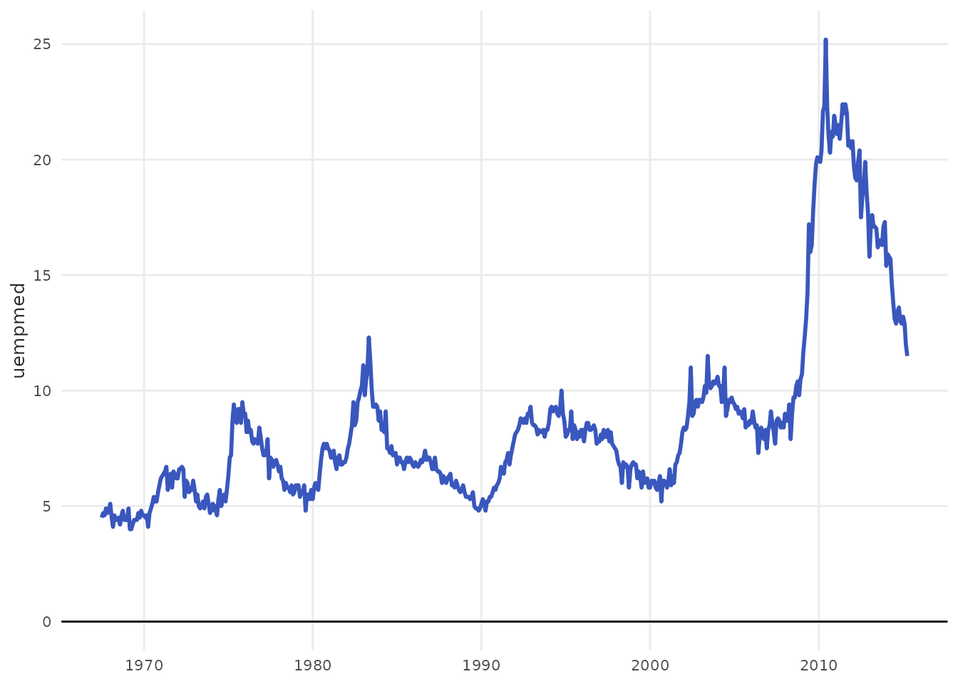
Bar chart
plot_column() creates a vertical bar chart. Setting
text = TRUE adds value labels above each bar; for bars with
enough height, text_inside = TRUE places labels inside the
bars instead (requires the ggfittext package).
sales <- data.frame(
  cities = c(
    "São Paulo",
    "Rio de Janeiro",
    "Belo Horizonte",
    "Porto Alegre",
    "Curitiba"
  ),
  revenue = c(125, 200, 150, 175, 80)
)

plot_column(sales, x = cities, y = revenue, text = TRUE)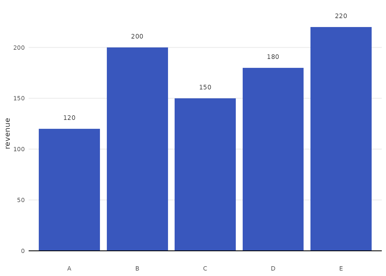
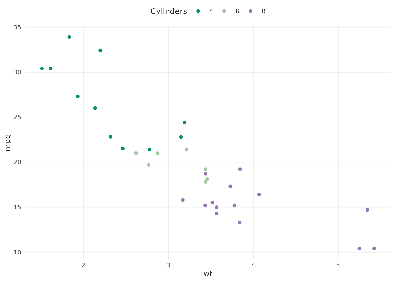
Scatter plot
plot_scatter() maps x and y to
a scatter plot. A color argument maps a grouping variable
to the point fill using a Benvi palette. Set smooth = TRUE
to overlay a regression line.
plot_scatter(
  mtcars,
  x = wt,
  y = mpg,
  color = as.factor(cyl),
  palette = "qual_5",
  scale_name = "Cylinders"
)
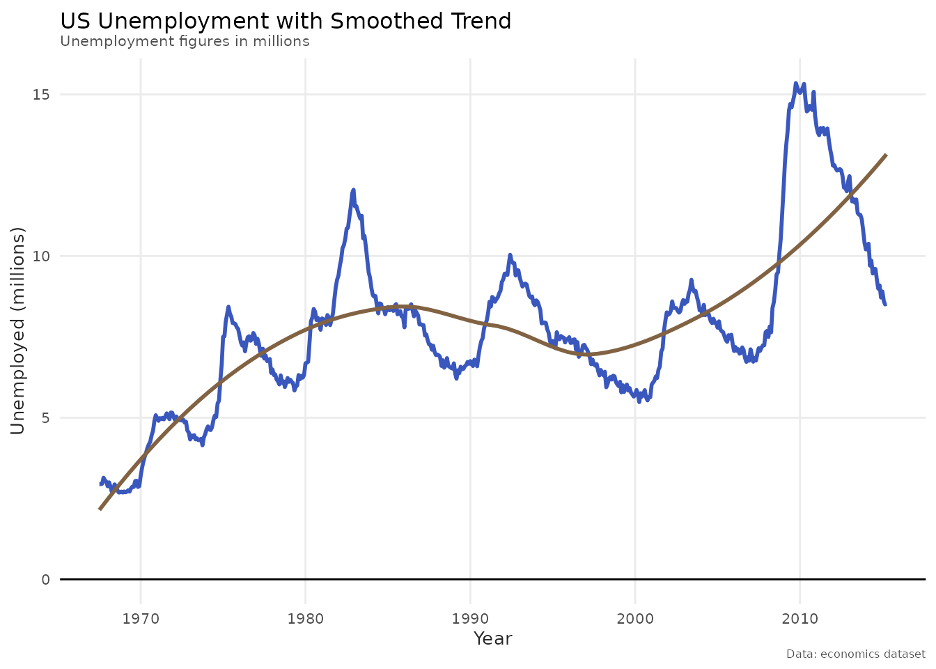
Adding layers
Because all helpers return ggplot2 objects, you can
extend them with additional layers, scales, or theme adjustments as you
normally would.
plot_line(economics, x = date, y = unemploy / 1000) +
  geom_smooth(se = FALSE, color = benvi_palette("oranges")[3]) +
  labs(
    title = "US Unemployment with Smoothed Trend",
    subtitle = "Unemployment figures in millions",
    x = NULL,
    y = "Unemployed (millions)",
    caption = "Data: economics dataset"
  )
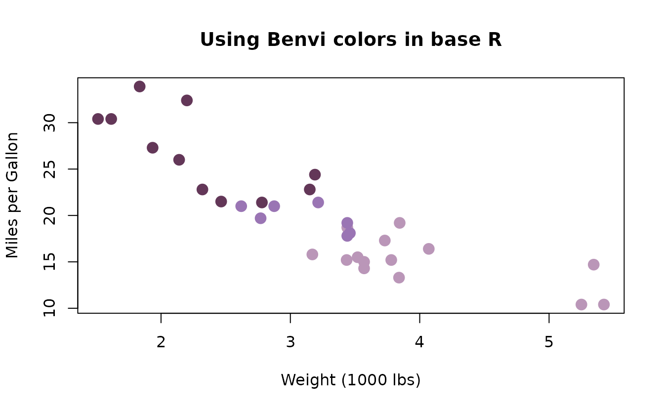
Base R
The palettes are not tied to ggplot2. Since
benvi_palette() returns plain hex codes, you can use them
anywhere that accepts color strings, including base R graphics,
lattice, or any other plotting system.
colors <- as.character(benvi_palette("purples"))

plot(
  mtcars$wt,
  mtcars$mpg,
  col = colors[mtcars$cyl / 2 - 1],
  pch = 19,
  cex = 1.5,
  xlab = "Weight (1000 lbs)",
  ylab = "Miles per Gallon",
  main = "Using Benvi colors in base R"
)
Getting Help
-
Function documentation:
?benvi_palette,?theme_benvi,?scale_color_benvi_d - Package website: https://viniciusoike.github.io/benviplot/
- Report issues: https://github.com/viniciusoike/benviplot/issues