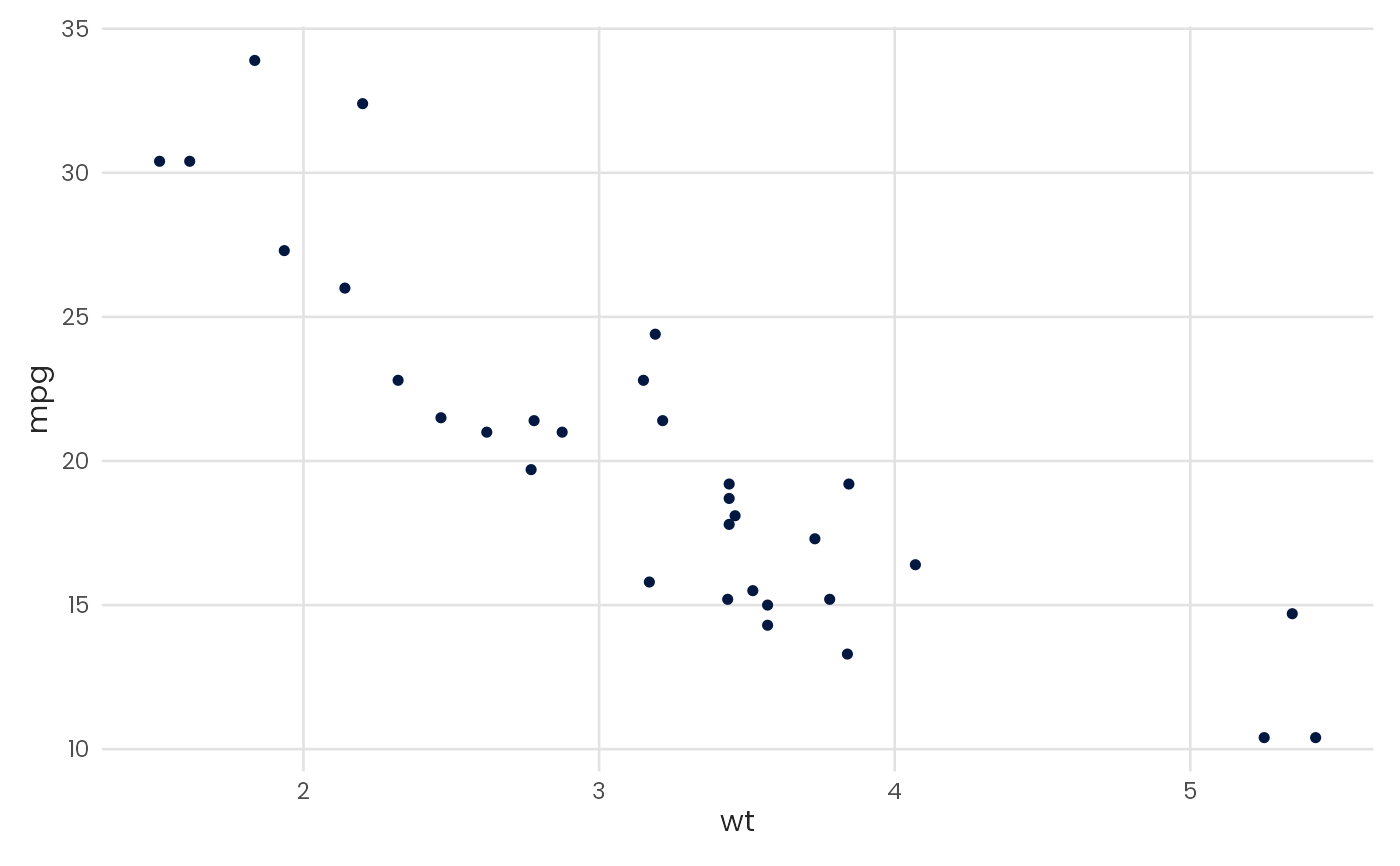
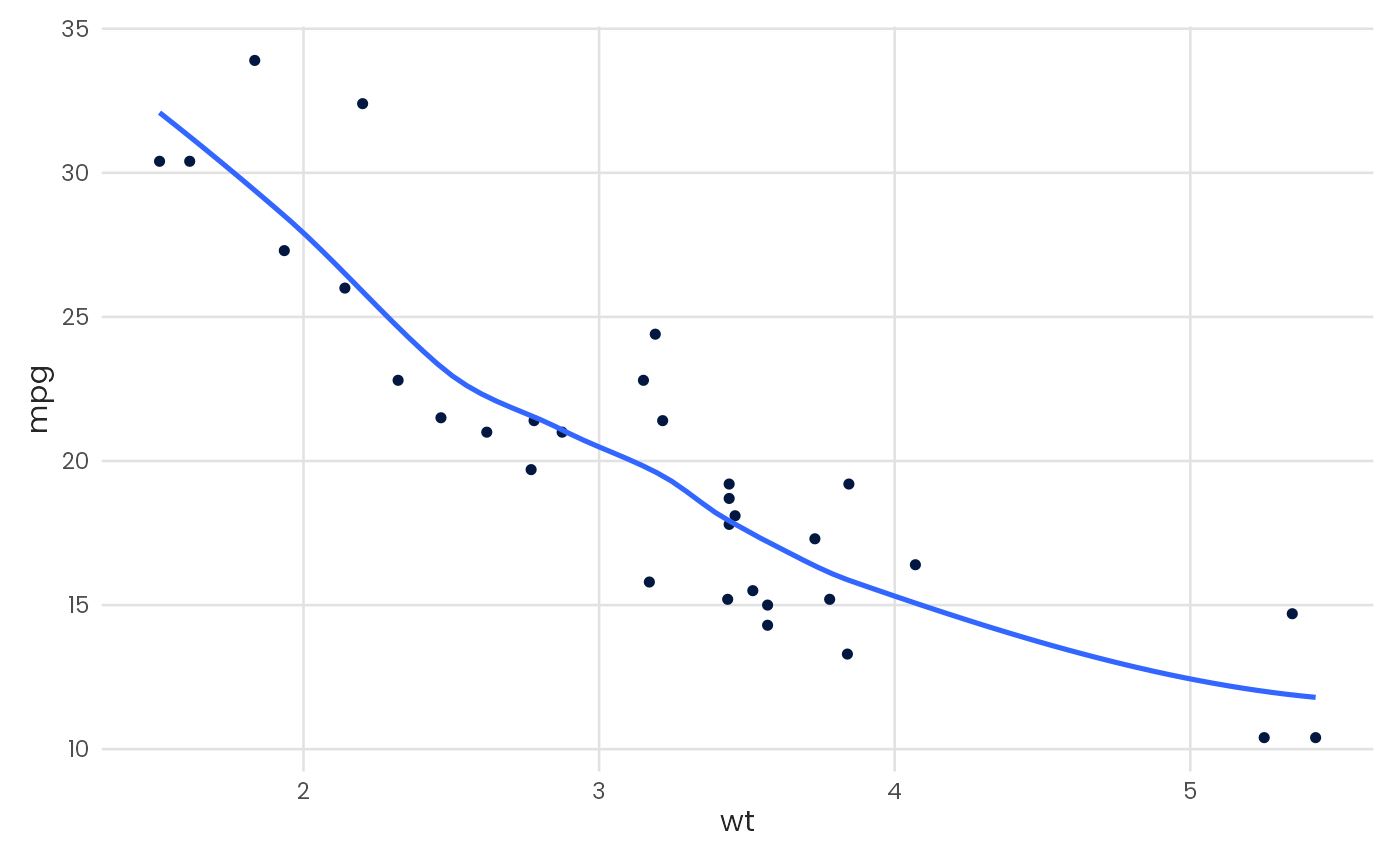
Plot a scatter chart
Usage
plot_scatter(
  data,
  x,
  y,
  color = NULL,
  fit = FALSE,
  fit_variable = FALSE,
  fit_method = "auto",
  fit_formula = NULL,
  fit_color = NULL,
  fit_ci = FALSE,
  zero = "none",
  pal_name = "qual_benvi",
  scale_name = "",
  scale_label = ggplot2::waiver(),
  ...
)
Arguments
- data
A data.frame type object
- x
<
data-masked> Variable to be mapped in the x-axis.- y
<
data-masked> Variable to be mapped in the y-axis.- color
Color of the points. Either a color string (e.g.,
"blue","#021841") for a single static color, or a bare column name (without quotes) to map a grouping variable to color. Continuous numeric variables automatically use a continuous color scale.- fit
Logical indicating if a regression line should be plotted on top of the chart.
- fit_variable
Logical indicating if regression should be grouped. Defaults to
FALSE.- fit_method
Type of model to generate regression line. See
geom_smoothfor more control and details. Defaults to"auto".- fit_formula
A formula for fit_method. See
geom_smooth.- fit_color
Color of the fitted regression line. Only applied when
fit_variable = FALSE. WhenNULL(default), uses automatic color selection. Whenfit_variable = TRUE, the fit line colors are inherited from the grouping variable and this parameter is ignored.- fit_ci
Logical indicating if confidence interval should be plotted. Defaults to
FALSEfor less cluttered visualization.- zero
Draws axis lines. Must be one of
"x","y","both", or"none"(default).- pal_name
String indicating the name of which palette to use.
- scale_name
String indicating fill legend title.
- scale_label
String indicating fill legend labels.
- ...
Further arguments to
geom_point