Introduction
This vignette provides a comprehensive guide to all color palettes
available in benviplot. You’ll learn about the different
palette types, when to use each one, and see visual examples of every
palette.
Palette Types
benviplot organizes palettes into several categories
based on their intended use:
- Basic Palettes (3 colors): Simple, versatile palettes
- Set Palettes (4 colors): Small categorical datasets
- Qualitative Palettes (8 colors): Larger categorical datasets
- Sequential Palettes (9 colors): Continuous/ordered data
- City-Specific Palettes: Themed palettes for Brazilian cities
- Index Palettes: Specialized single-color scales
Basic Palettes
Three fundamental palettes with 3 colors each:
# Basic palette (3 colors)
benvi_palette("basic")
When to use: Simple visualizations with 2-3 categories.
Example:
data <- data.frame(
  category = c("Low", "Medium", "High"),
  value = c(23, 45, 32)
)

ggplot(data, aes(x = category, y = value, fill = category)) +
  geom_col(show.legend = FALSE) +
  scale_fill_benvi_d(pal_name = "basic") +
  labs(title = "Using Basic Palette", x = NULL, y = "Value") +
  theme_benvi()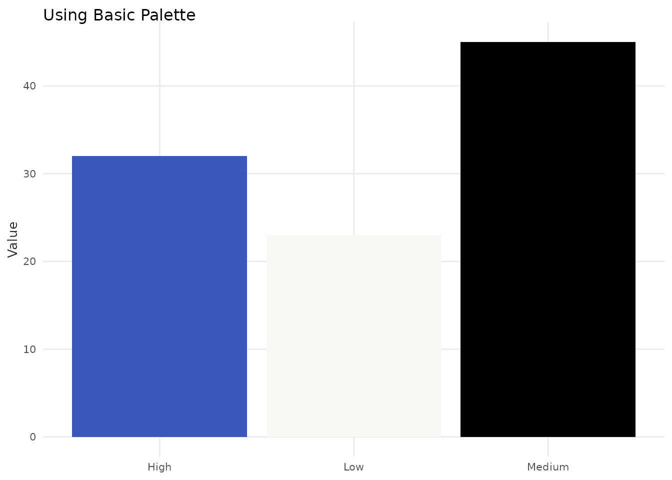
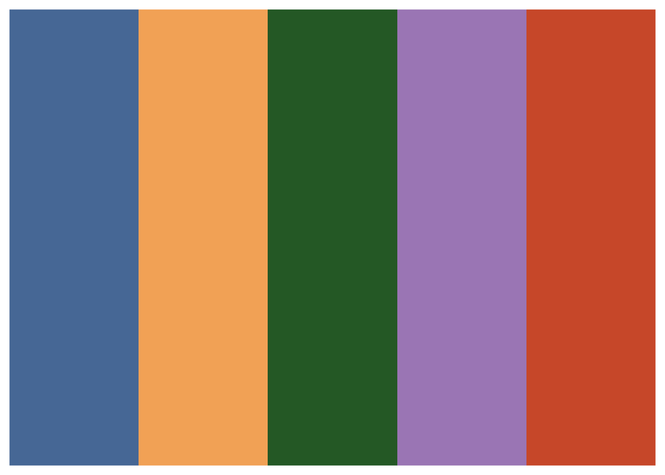
Set Palettes (Set0 - Set7)
Eight themed palettes, each with 4 carefully selected colors. Ideal for small categorical datasets.
# Display all theme palettes
theme_names <- c("grays", "browns", "yellows", "greens", "blues", "purples", "pinks", "oranges")

for (pal_name in theme_names) {
  print(benvi_palette(pal_name))
}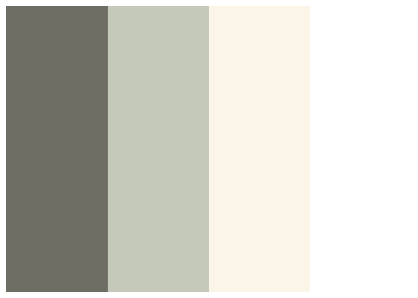

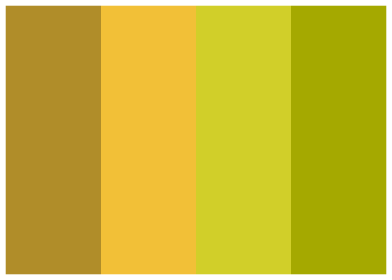


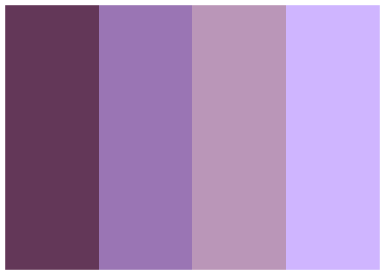
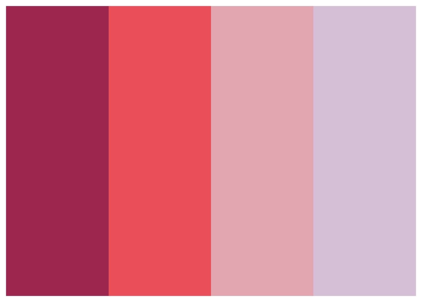
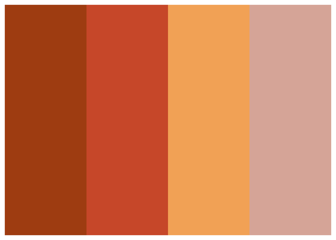
When to use: - Categorical data with 2-4 groups - Charts where you need strong color contrast - Professional presentations
Example:
# Sample data with 4 regions
regions <- data.frame(
  region = c("North", "South", "East", "West"),
  sales = c(120, 150, 130, 160)
)

ggplot(regions, aes(x = region, y = sales, fill = region)) +
  geom_col(show.legend = FALSE) +
  scale_fill_benvi_d(pal_name = "purples") +
  labs(title = "Regional Sales", x = NULL, y = "Sales ($1000s)") +
  theme_benvi()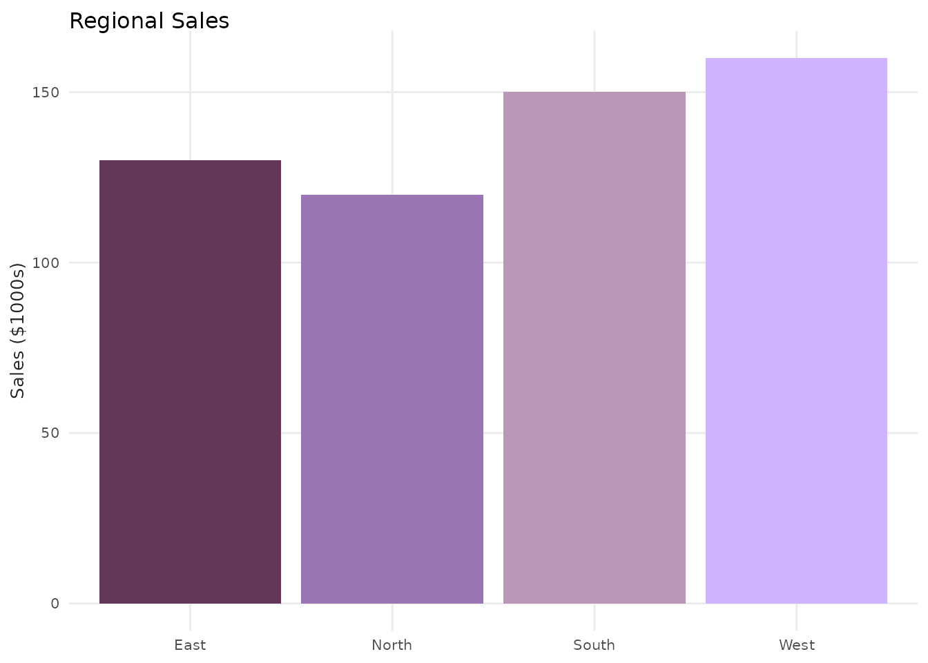
Qualitative Palettes (Qual1 - Qual9)
Nine palettes with 8 distinct colors each. Designed for larger categorical datasets where you need many distinguishable colors.
# Display all Qualitative palettes
qual_names <- paste0("qual_", 1:9)

for (pal_name in qual_names) {
  print(benvi_palette(pal_name))
}


When to use: - Categorical data with 5-8 groups - Complex visualizations with many categories - Dashboards and multi-series charts
Example:
# Use mtcars with multiple groups
ggplot(mtcars, aes(x = wt, y = mpg, color = as.factor(carb))) +
  geom_point(size = 3) +
  scale_color_benvi_d(pal_name = "qual_3", name = "Carburetors") +
  labs(
    title = "MPG vs Weight by Carburetor Count",
    x = "Weight (1000 lbs)",
    y = "Miles per Gallon"
  ) +
  theme_benvi()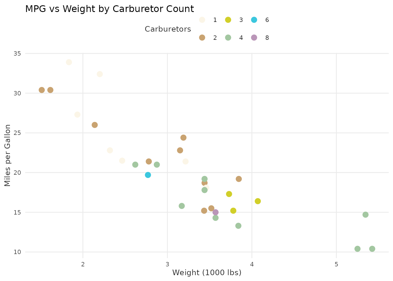
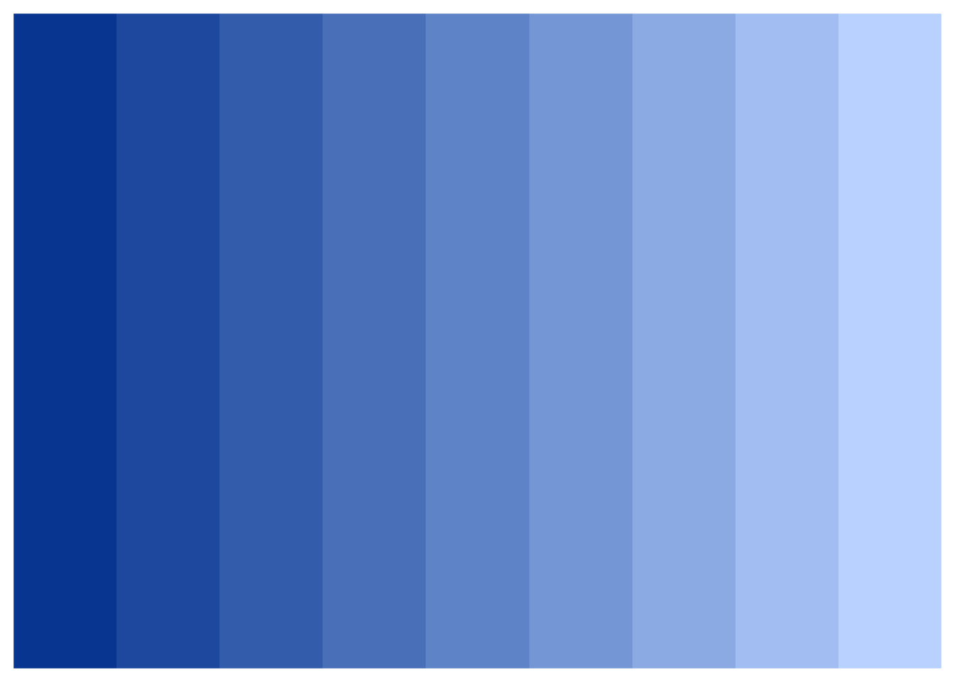
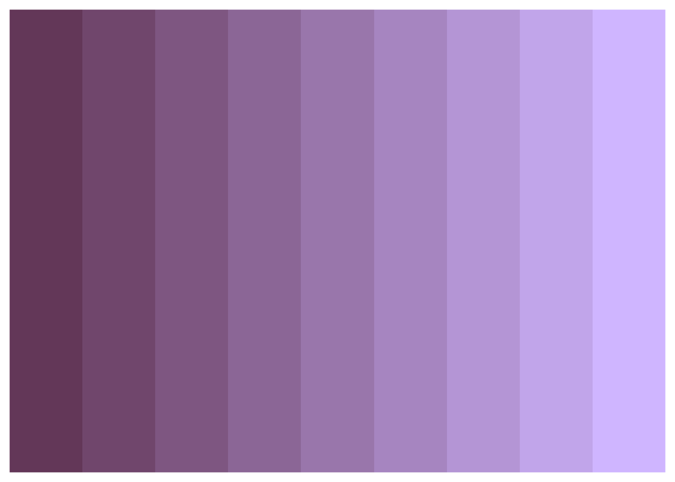
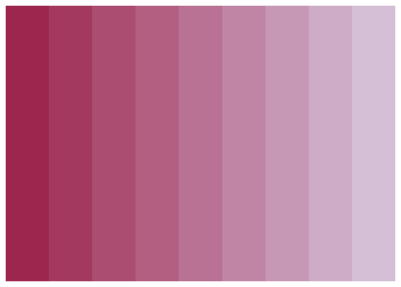
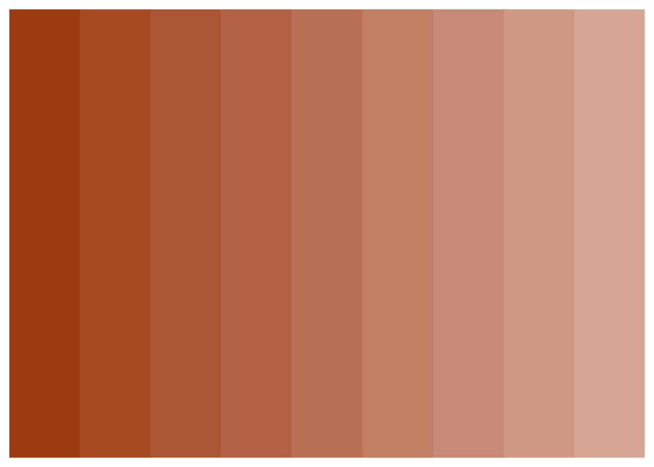
Sequential Palettes (Seq0 - Seq7)
Eight gradient palettes with 9 colors each, transitioning from light to dark. Perfect for continuous or ordered data.
# Display all Sequential palettes
seq_names <- c("seq_grays", "seq_browns", "seq_yellows", "seq_greens", "seq_blues", "seq_purples", "seq_pinks", "seq_oranges")

for (pal_name in seq_names) {
  print(benvi_palette(pal_name))
}
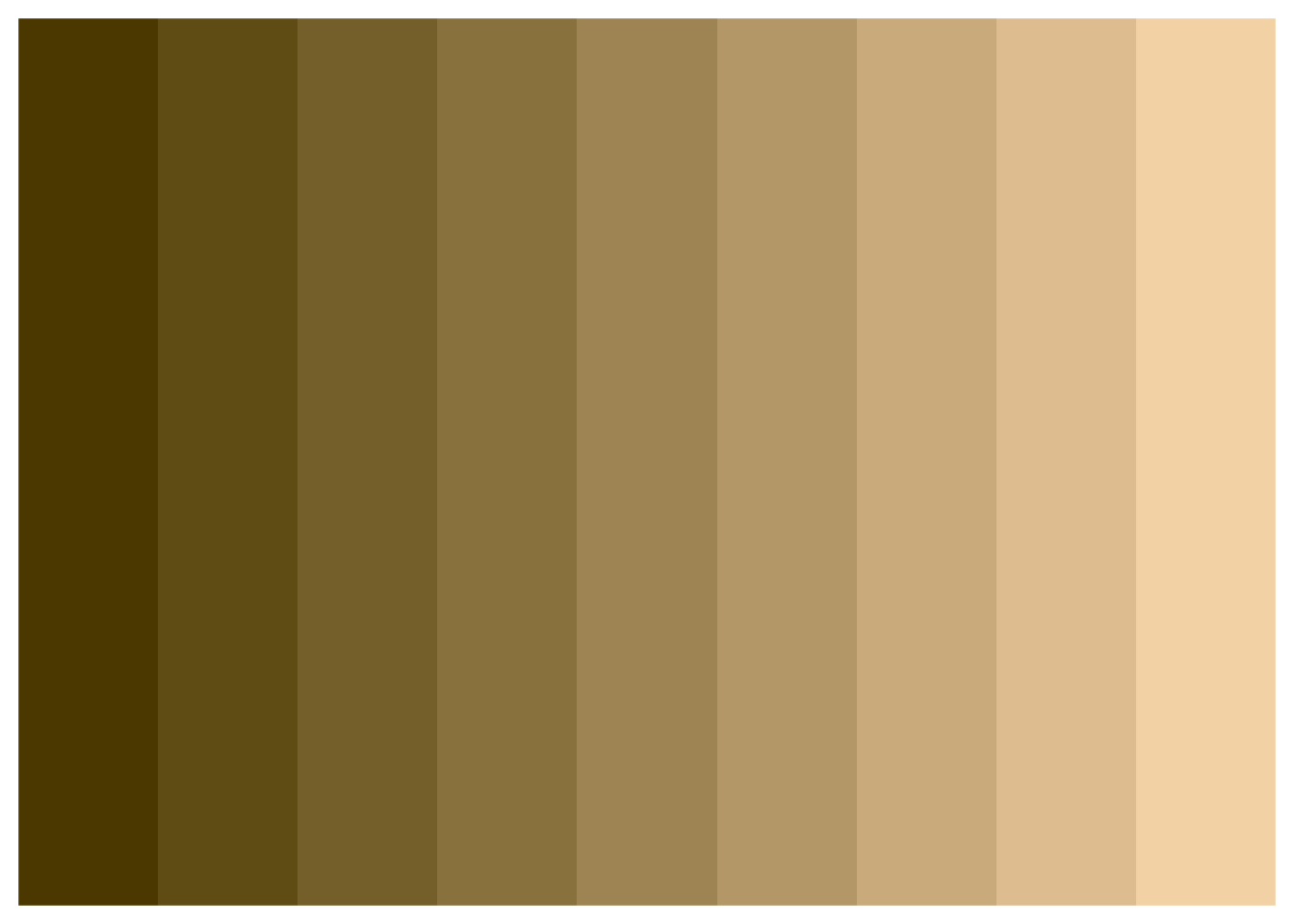

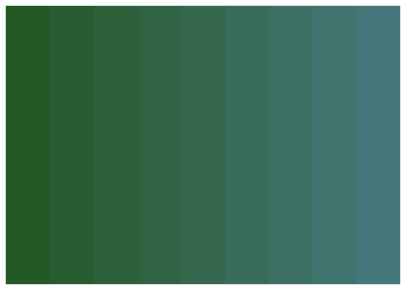
When to use: - Continuous numerical data - Heatmaps and choropleth maps - Ordered categorical data (e.g., Low/Medium/High) - Data where progression/intensity matters
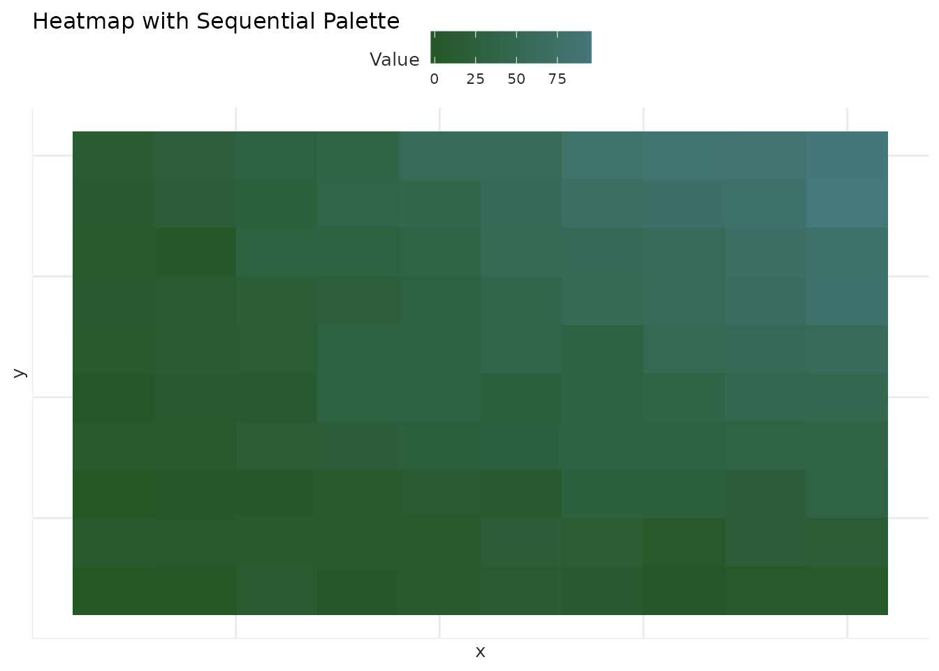
Example:
# Create a heatmap
set.seed(123)
heatmap_data <- expand.grid(
  x = 1:10,
  y = 1:10
)
heatmap_data$value <- with(heatmap_data, x * y + rnorm(100, 0, 5))

ggplot(heatmap_data, aes(x = x, y = y, fill = value)) +
  geom_tile() +
  scale_fill_benvi_c(pal_name = "seq_greens", name = "Value") +
  labs(title = "Heatmap with Sequential Palette") +
  theme_benvi() +
  theme(
    axis.text = element_blank(),
    axis.ticks = element_blank()
  )
City-Specific Palettes
Themed palettes for three major Brazilian cities. Each city has qualitative, sequential, and diverging variants.


Belo Horizonte Palettes
benvi_palette("bhe_seq")
benvi_palette("bhe_div")
When to use: - Geographic visualizations (maps, regional data) - Reports specific to these cities - When you want location-themed aesthetics
Example:
# Sample city data
city_data <- data.frame(
  district = c("Centro", "Zona Sul", "Zona Norte", "Zona Oeste"),
  price = c(5500, 7200, 3800, 4100)
)

ggplot(city_data, aes(x = district, y = price, fill = district)) +
  geom_col(show.legend = FALSE) +
  scale_fill_benvi_d(pal_name = "rio_qual") +
  labs(
    title = "Average Rent by District - Rio de Janeiro",
    x = NULL,
    y = "Price (R$)"
  ) +
  theme_benvi() +
  theme(axis.text.x = element_text(angle = 45, hjust = 1))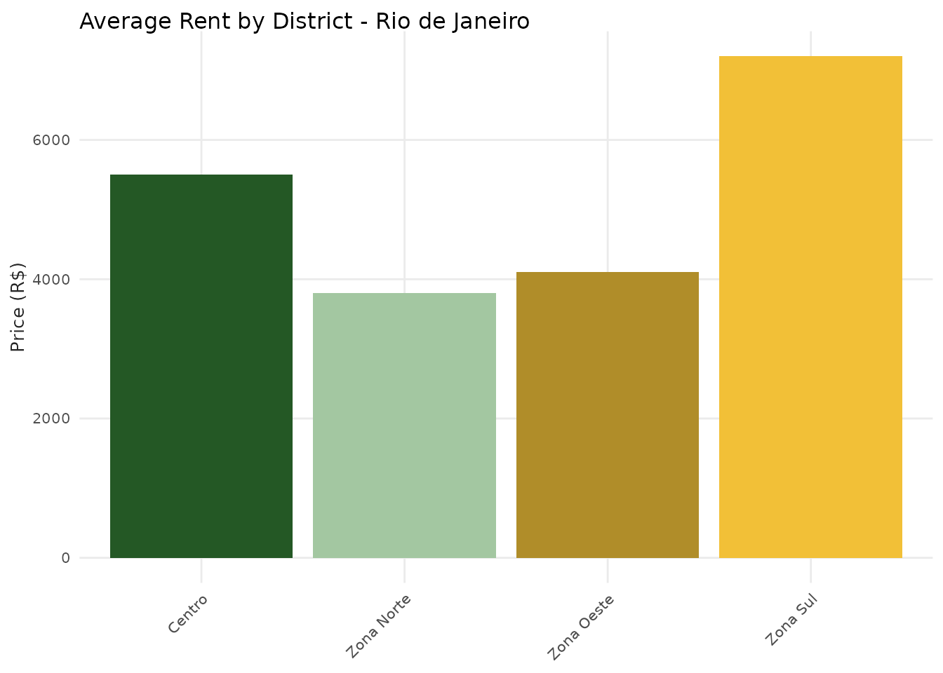
Index Palettes
Specialized single-color gradients for index visualizations.
# Blue index
benvi_palette("benvi_blue")
# Purple index
benvi_palette("benvi_purple")
When to use: - Financial indices and time series - Single-metric dashboards - When you want monochromatic emphasis
Example:
# Stock index over time
index_data <- data.frame(
  date = seq.Date(as.Date("2020-01-01"), as.Date("2024-12-31"), by = "month"),
  index = 100 + cumsum(rnorm(60, 0.5, 3))
)

ggplot(index_data, aes(x = date, y = index)) +
  geom_line(color = benvi_palette("benvi_blue")[7], linewidth = 1) +
  geom_area(fill = benvi_palette("benvi_blue")[3], alpha = 0.3) +
  labs(
    title = "Market Index Over Time",
    x = "Date",
    y = "Index Value"
  ) +
  theme_benvi()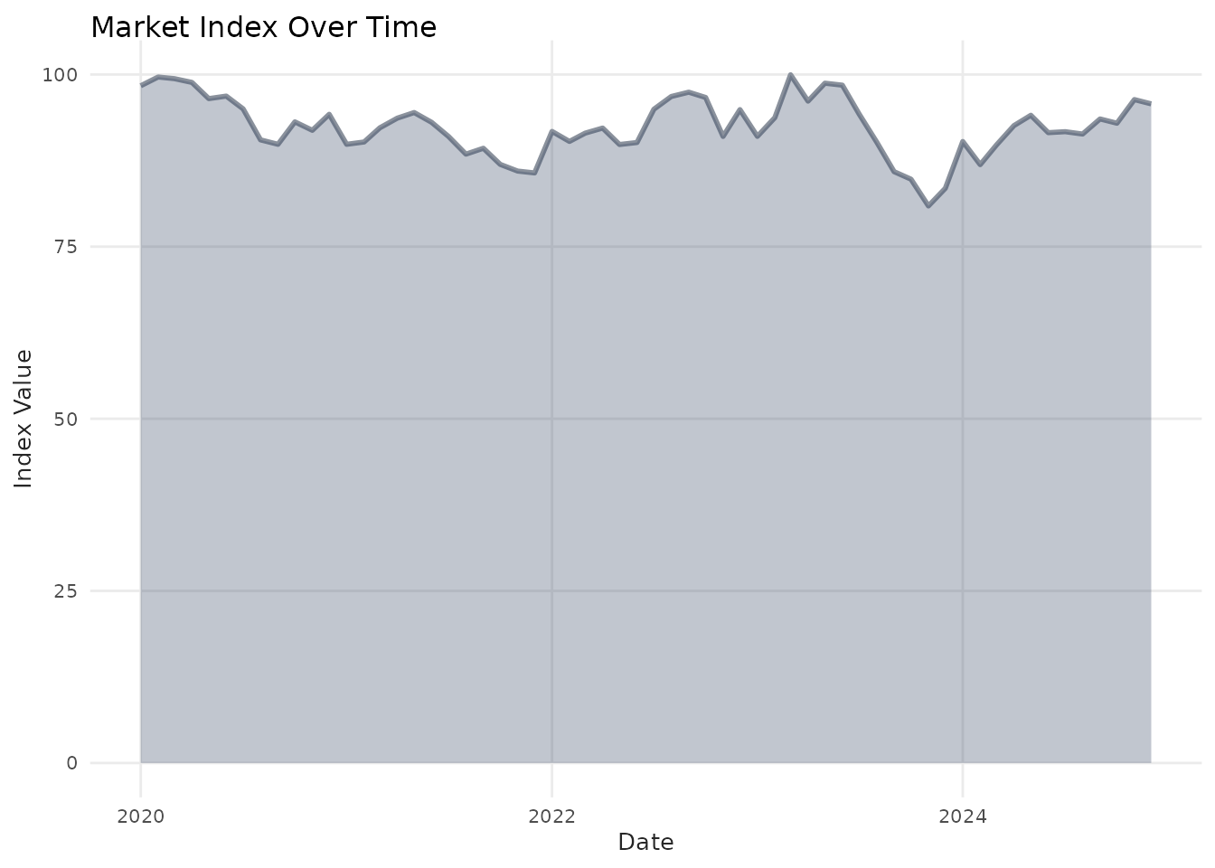
Advanced Usage
Reversing Palettes
Any palette can be reversed using direction = -1:
# Original
benvi_palette("seq_purples")
# Reversed
benvi_palette("seq_purples", direction = -1)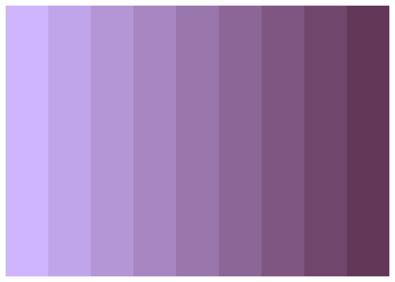
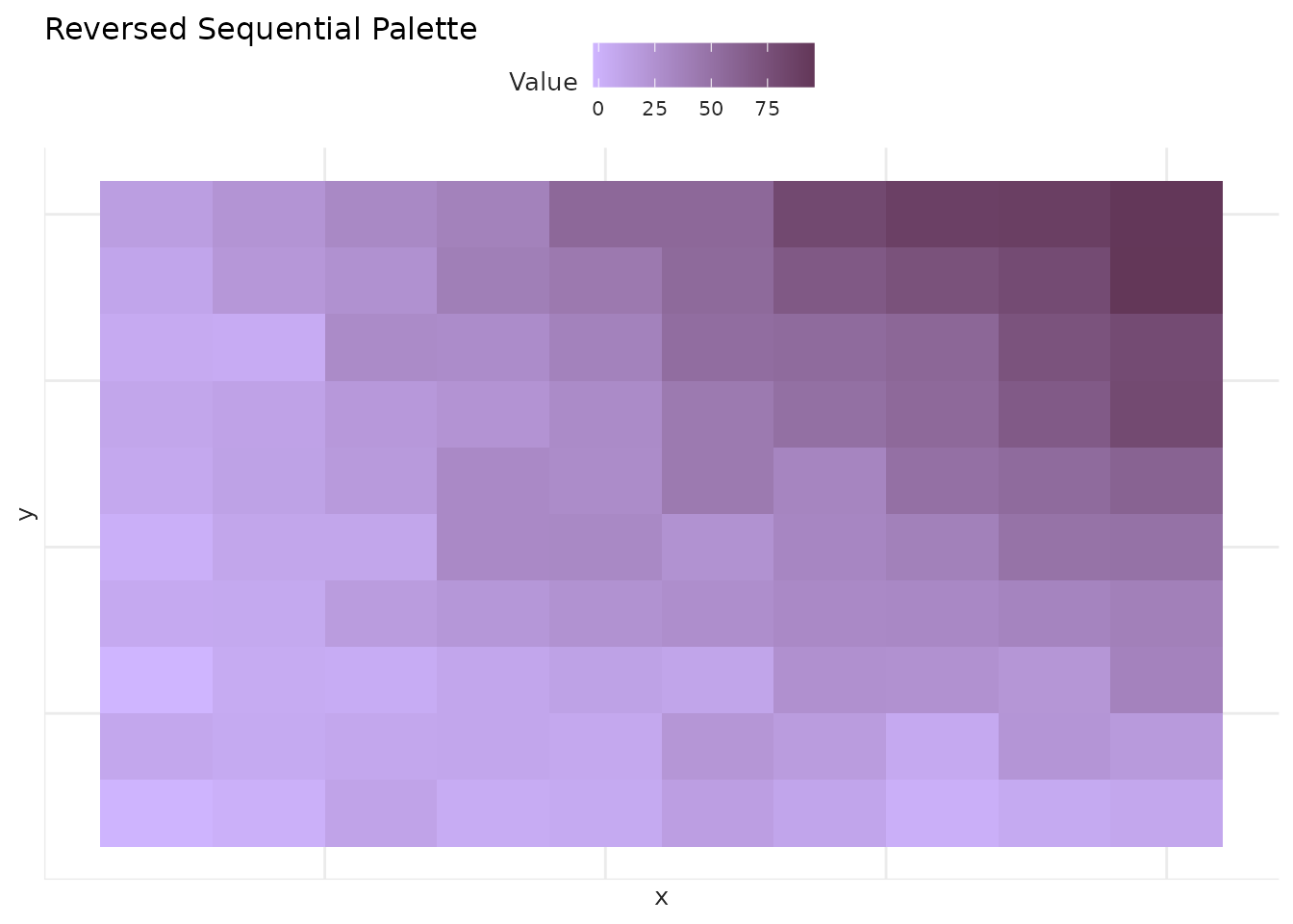
This is useful when you want dark-to-light instead of light-to-dark:
ggplot(heatmap_data, aes(x = x, y = y, fill = value)) +
  geom_tile() +
  scale_fill_benvi_c(pal_name = "seq_purples", direction = -1, name = "Value") +
  labs(title = "Reversed Sequential Palette") +
  theme_benvi() +
  theme(
    axis.text = element_blank(),
    axis.ticks = element_blank()
  )
Extracting Specific Colors
Get individual colors from a palette:
# Get the 3rd color from Qual5
my_color <- benvi_palette("qual_5")[3]
my_color
#> [1] "#9A75B4"

# Use in a plot
ggplot(mtcars, aes(x = wt, y = mpg)) +
  geom_point(color = my_color, size = 3) +
  labs(title = "Using a Single Extracted Color") +
  theme_benvi()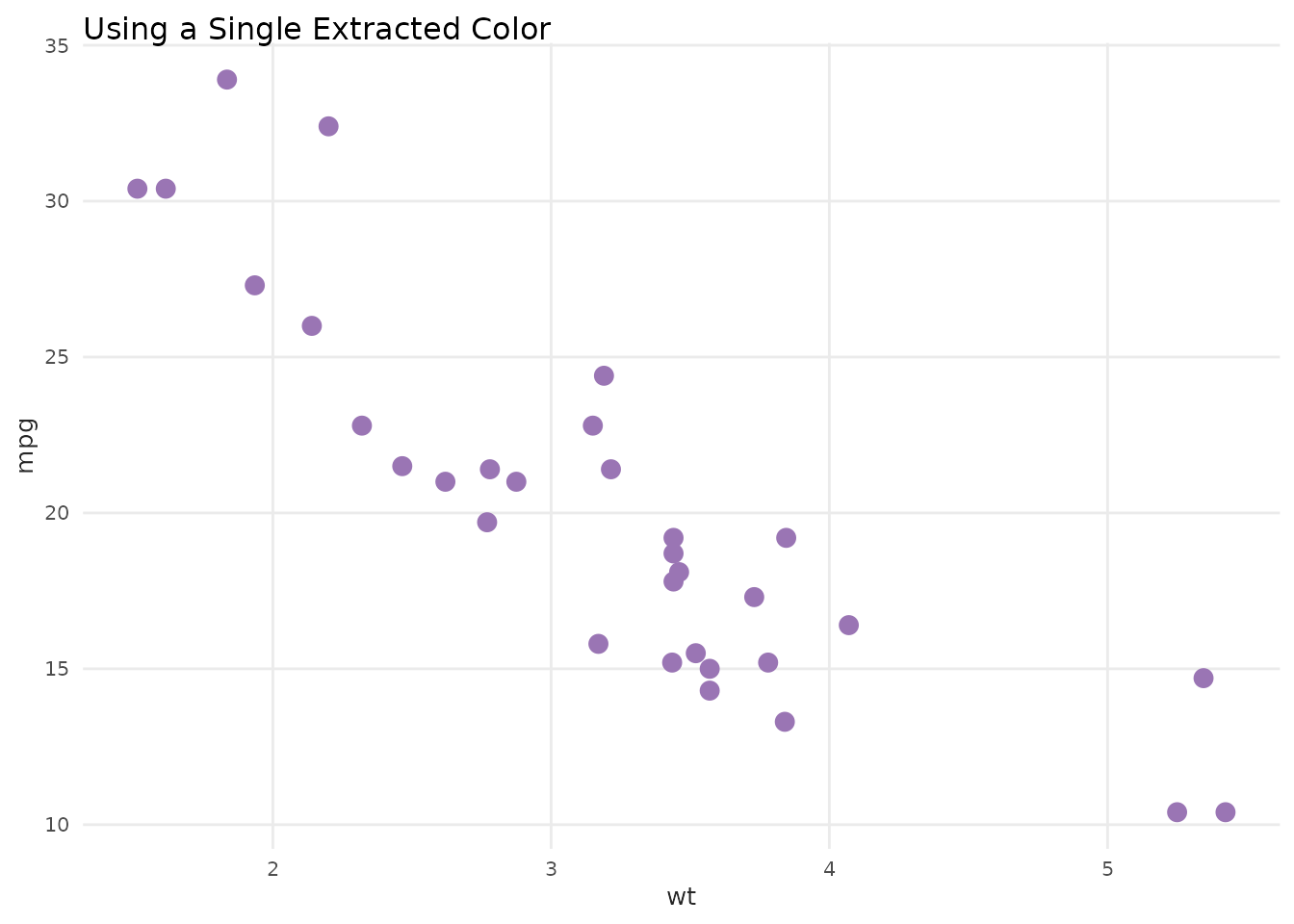
Custom Number of Colors
For discrete palettes, request fewer colors:
# Get only 4 colors from an 8-color palette
benvi_palette("qual_7", n = 4)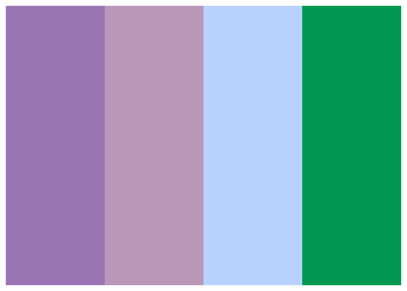
For continuous palettes, interpolate any number:
# Interpolate to get 15 colors
benvi_palette("seq_yellows", n = 15, type = "continuous")
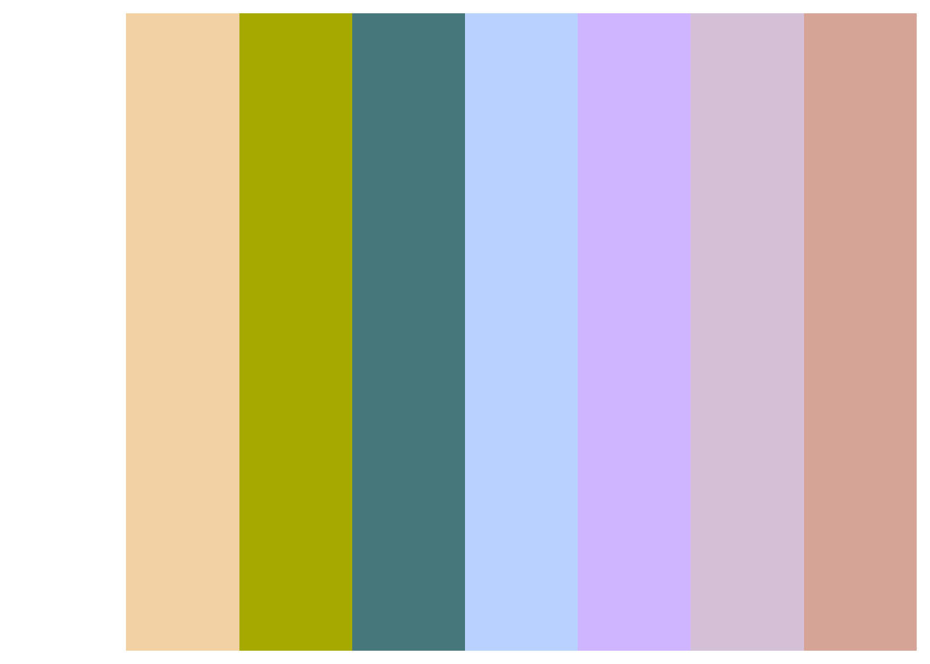
Combining Palettes
Mix colors from different palettes for custom schemes:
# Create custom palette from multiple sources
custom_colors <- c(
  benvi_palette("greens")[1],
  benvi_palette("qual_5")[4],
  benvi_palette("rio_qual")[2],
  benvi_palette("seq_oranges")[8]
)

# Use in plot
sample_data <- data.frame(
  category = LETTERS[1:4],
  value = c(25, 40, 35, 30)
)

ggplot(sample_data, aes(x = category, y = value, fill = category)) +
  geom_col(show.legend = FALSE) +
  scale_fill_manual(values = custom_colors) +
  labs(title = "Custom Combined Palette") +
  theme_benvi()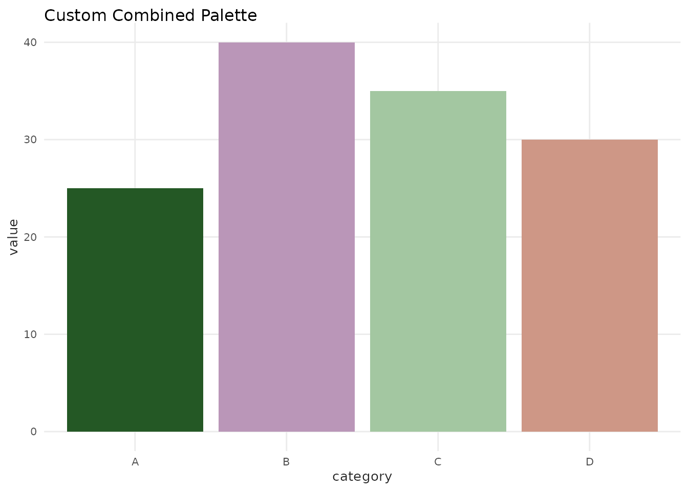
Accessibility Considerations
When choosing palettes, consider:
- Color blindness: Test palettes with color blindness simulators
- Print compatibility: Sequential palettes work best in grayscale
- Contrast: Ensure sufficient contrast for readability
- Number of colors: Don’t use more categories than necessary
Tips for Accessibility
- Limit categories: Use 5-7 colors maximum when possible
- Add patterns: Combine colors with line types or shapes
- Use labels: Don’t rely solely on color to convey information
# Example with both color and shape
ggplot(mtcars, aes(x = wt, y = mpg, color = as.factor(cyl), shape = as.factor(cyl))) +
  geom_point(size = 3) +
  scale_color_benvi_d(pal_name = "purples", name = "Cylinders") +
  scale_shape_manual(values = c(16, 17, 15), name = "Cylinders") +
  labs(
    title = "Using Color AND Shape for Accessibility",
    x = "Weight (1000 lbs)",
    y = "Miles per Gallon"
  ) +
  theme_benvi()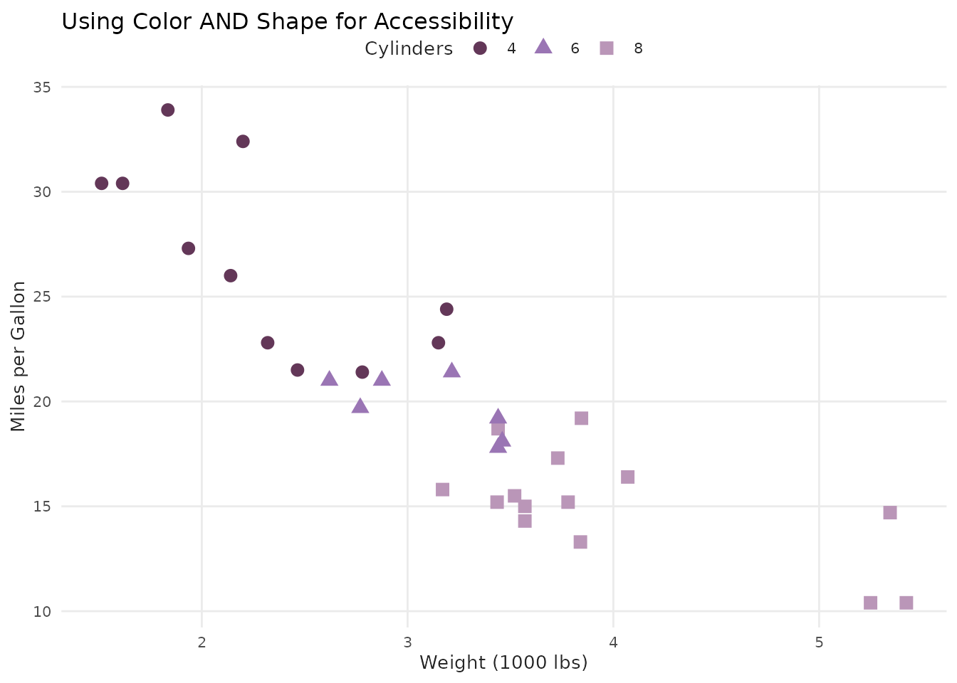
Palette Selection Guide
Quick reference for choosing the right palette:
| Data Type | Palette Type | Examples | Color Count |
|---|---|---|---|
| 2-3 categories | Basic | basic | 3 |
| 2-4 categories | Theme | grays, browns, yellows, etc. | 4 |
| 5-8 categories | Qualitative | qual_1, qual_2, …, qual_9 | 8 |
| Continuous data | Sequential | seq_grays, seq_blues, etc. | 9 (interpolated) |
| Geographic (cities) | City-specific | spo_, rio_, bhe_* | 4-8 |
| Single metric | Brand | benvi_blue, benvi_purple | 9 |
Complete Palette Gallery
Here’s a quick visual reference of all available palettes:
# Create a function to display palette swatches
show_palette_grid <- function(palette_names, title) {
  n_pals <- length(palette_names)
  par(mfrow = c(ceiling(n_pals / 2), 2), mar = c(1, 4, 2, 1))

  for (pal_name in palette_names) {
    pal <- benvi_palette(pal_name)
    n_colors <- length(pal)

    plot(
      1:n_colors,
      rep(1, n_colors),
      col = pal,
      pch = 15,
      cex = 4,
      axes = FALSE,
      xlab = "",
      ylab = "",
      main = pal_name,
      xlim = c(0.5, n_colors + 0.5)
    )
  }

  mtext(title, outer = TRUE, line = -2, cex = 1.5, font = 2)
}

# Display theme palettes
show_palette_grid(c("grays", "browns", "yellows", "greens", "blues", "purples", "pinks", "oranges"), "Theme Palettes")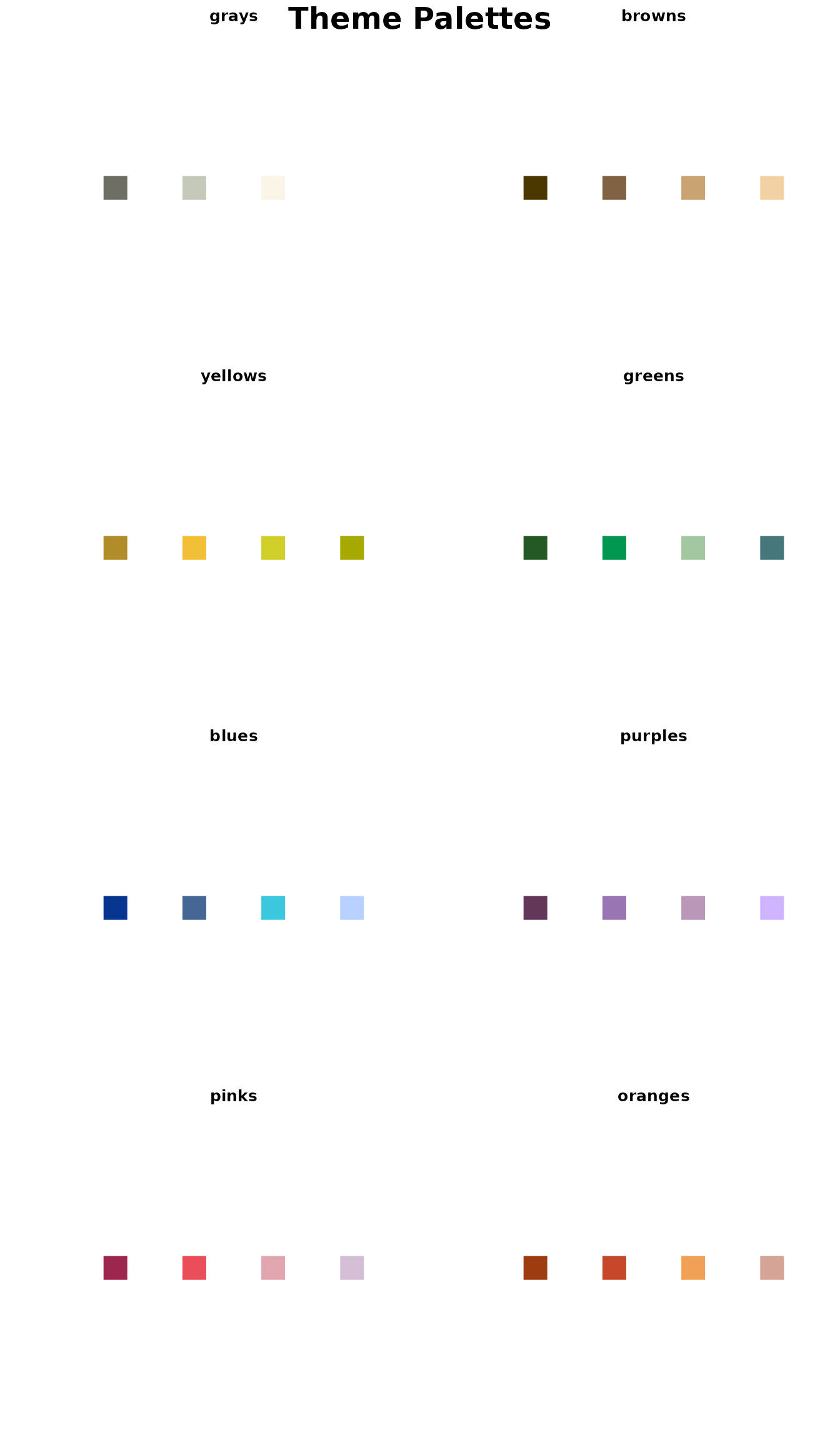
# Display Qualitative palettes
show_palette_grid(paste0("qual_", 1:9), "Qualitative Palettes")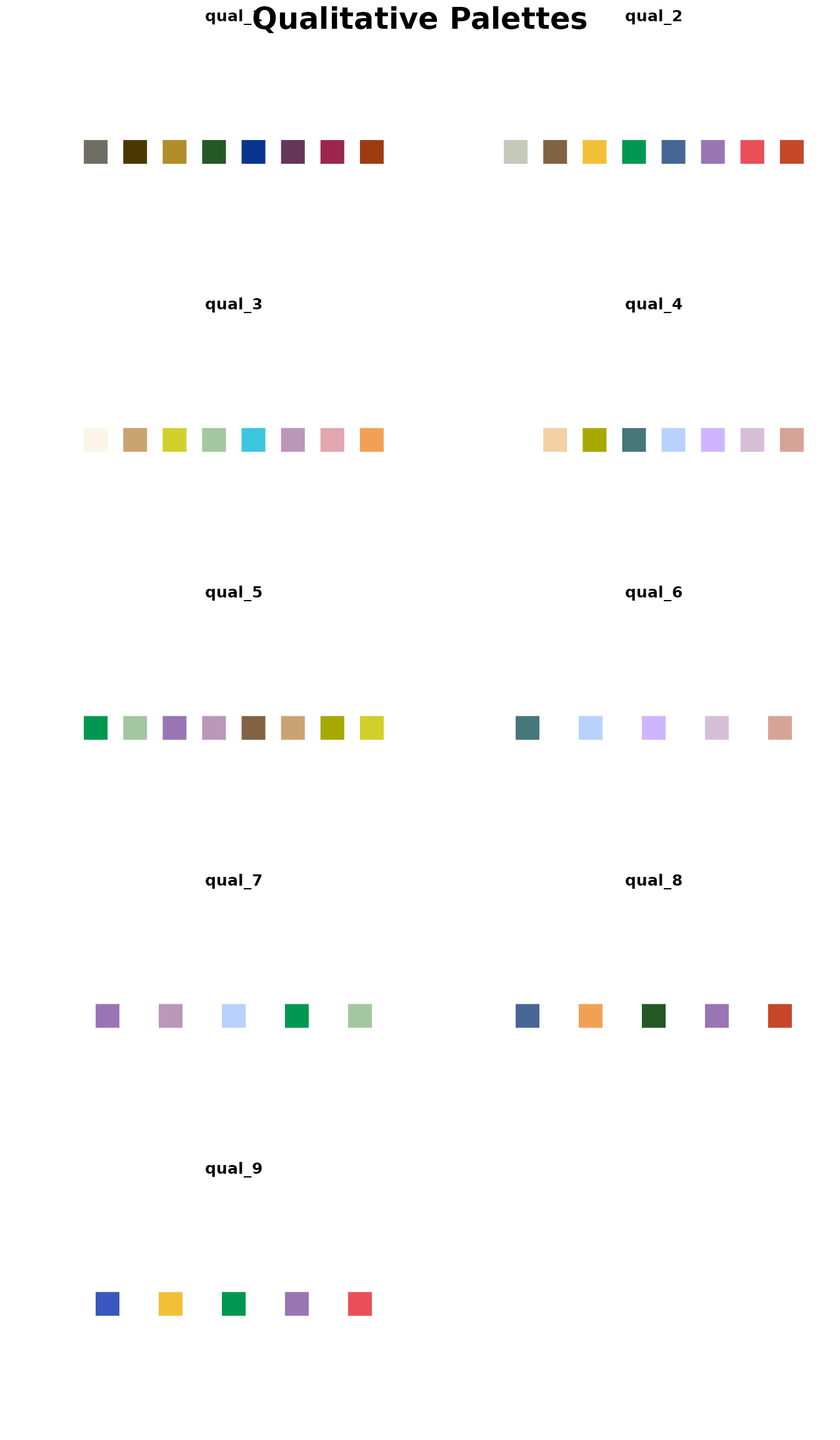
# Display Sequential palettes
show_palette_grid(c("seq_grays", "seq_browns", "seq_yellows", "seq_greens", "seq_blues", "seq_purples", "seq_pinks", "seq_oranges"), "Sequential Palettes")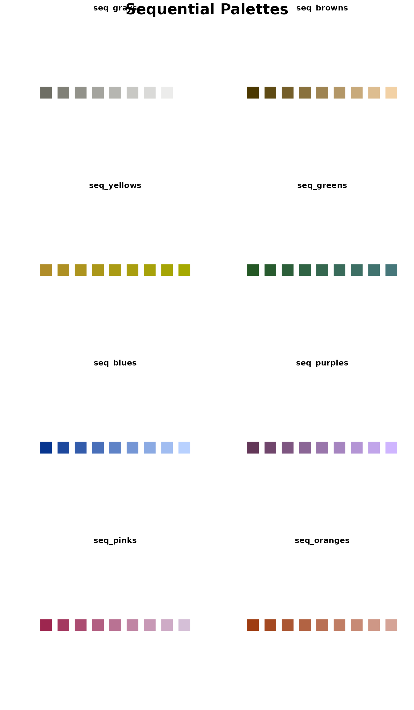
Summary
In this vignette you learned:
- ✓ All available palette types and when to use them
- ✓ How to view and extract colors from palettes
- ✓ Advanced techniques (reversing, combining, interpolating)
- ✓ Accessibility considerations for color choices
- ✓ Quick reference guide for palette selection
Next Steps
- See
vignette("plot-functions")for using palettes with helper functions - See
vignette("themes-and-styling")for advanced theme customization - Explore the function reference at
?benvi_paletteand?scale_color_benvi_d
Further Reading
For more on color theory and data visualization:
- Colorbrewer - Color advice for cartography
- Adobe Color - Color wheel and palette tools