Augmenting Trends
augment_trends() is one of the core function of
trendseries: it adds one or more
trend_{method} columns to a data frame, estimating the
underlying “direction” of a time series. This vignette walks through the
interface in detail: a first single-method example, grouped and
multi-method extraction, and fine control over method-specific
parameters.
Note that dplyr isn’t required for
trendseries to work. In fact, trendseries
should work with any data.frame-type object.
The settings below are only defined for aesthetic purposes and can be ignored.
library(ggplot2)
library(ekioplot)

series_palette <- unname(c(
  ekio_pal("blue")["700"],
  ekio_pal("blue")["400"],
  ekio_pal("teal")["600"]
))
highlight_gold <- unname(ekio_pal("gold")["light"])
highlight_orange <- unname(ekio_pal("orange")["400"])
article_palette <- c(series_palette, highlight_gold, highlight_orange)

article_theme <- theme_ekio(background = "white") +
  theme(
    legend.position = "bottom",
    axis.title.x = element_blank(),
    palette.colour.discrete = article_palette,
    palette.fill.discrete = article_palette
  )
Trend extraction vs decomposition and detrending
It is worth being clear about what augment_trends() does
and does not do.
-
augment_trends()returns only the trend (trend_*columns): a single smooth component, with the seasonal and irregular movements simply smoothed away. -
decompose_series()builds on the same engine but returns all three components — trend, seasonal, and remainder. See the Decomposing Series vignette. -
detrend_series()is the mirror image: it fits the trend withaugment_trends()and then subtracts it, returning the deviation from trend (the cycle). See the Detrending Series vignette.
This vignette focuses on augment_trends() itself: the
pipe-friendly data frame interface, its
ts/xts/zoo counterpart
extract_trends(), and the shared parameter system both
use.
A first trend
trendseries comes with some useful datasets, some of
which will be presented in this vignette. The electric
dataset contains monthly electric consumption for Brazilian households
from 1979 to 2025.
head(electric)
#> # A tibble: 6 × 2
#>   date       consumption
#>   <date>           <dbl>
#> 1 1979-02-01        1647
#> 2 1979-03-01        1736
#> 3 1979-04-01        1681
#> 4 1979-05-01        1757
#> 5 1979-06-01        1689
#> 6 1979-07-01        1730

ggplot(electric, aes(date, consumption)) +
  geom_line(lwd = 0.7) +
  article_theme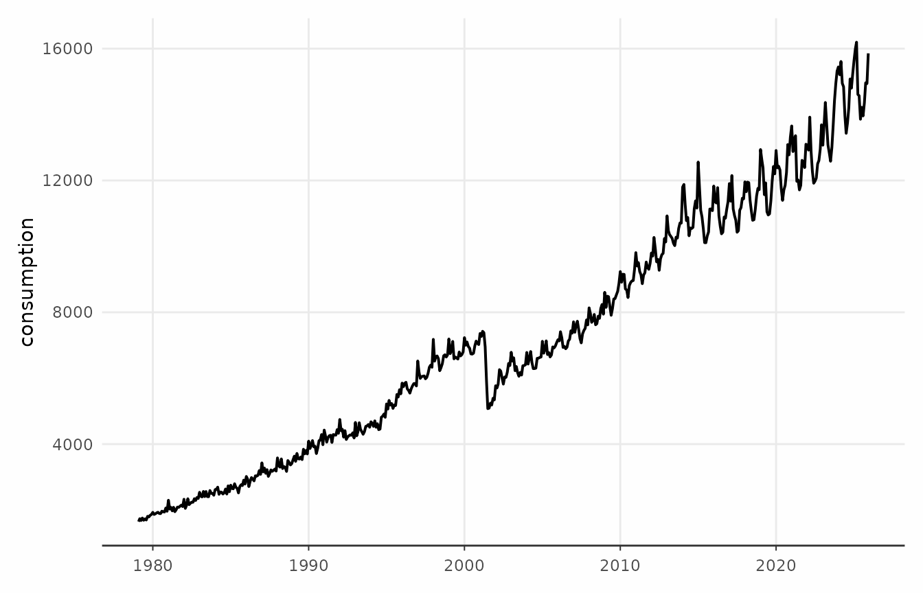
To estimate the trend we use augment_trends and select a
method: in this case, STL (see stats::stl). The
date_col (default "date") and
value_col (default "value") arguments identify
the relevant columns. The result is appended as a column named
trend_{method} such as “trend_stl”, “trend_ma” (for a
Moving Average), “trend_median” (for a Moving Median), etc.
elec_trend <- augment_trends(
  electric,
  date_col = "date",
  value_col = "consumption",
  methods = "stl"
)

head(elec_trend)
#> # A tibble: 6 × 3
#>   date       consumption trend_stl
#>   <date>           <dbl>     <dbl>
#> 1 1979-02-01        1647     1675.
#> 2 1979-03-01        1736     1695.
#> 3 1979-04-01        1681     1716.
#> 4 1979-05-01        1757     1731.
#> 5 1979-06-01        1689     1747.
#> 6 1979-07-01        1730     1761.
augment_trends will do its best to try to infer the
appropriate frequency but this information can be supplied manually.
elec_trend <- augment_trends(
  electric,
  date_col = "date",
  value_col = "consumption",
  methods = "stl",
  frequency = 12
)
There are two options to visualize the data using
ggplot2. The first is to convert the data to a “long”
format and define a “name” for each of the series. This should be the
default approach.
# Prepare data for plotting
plot_data <- elec_trend |>
  tidyr::pivot_longer(
    cols = -date,
    names_to = "series",
    values_to = "value"
  ) |>
  mutate(
    series = case_when(
      series == "consumption" ~ "Data (original)",
      series == "trend_stl" ~ "Trend (STL)"
    )
  )

# Create the plot
ggplot(plot_data, aes(x = date, y = value, color = series)) +
  geom_line(linewidth = 0.7) +
  labs(
    title = "Residential Electricity Consumption",
    x = NULL,
    y = "Electric Consumption (GWh)",
    color = NULL
  ) +
  article_theme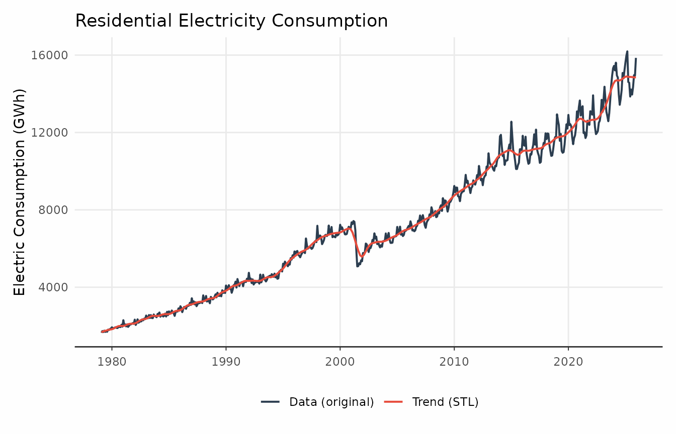
An alternative is to add the trend as an additional
geom_line layer. This is quicker but doesn’t scale as
well.
ggplot(elec_trend, aes(x = date)) +
  geom_line(
    aes(y = consumption, color = "Original"),
    linewidth = 0.7,
    alpha = 0.5
  ) +
  geom_line(
    aes(y = trend_stl, color = "Trend (STL)"),
    linewidth = 1
  ) +
  labs(
    title = "Residential Electricity Consumption",
    subtitle = "Decomposition using an STL trend",
    x = NULL,
    y = "Electric Consumption (GWh)",
    color = NULL
  ) +
  article_theme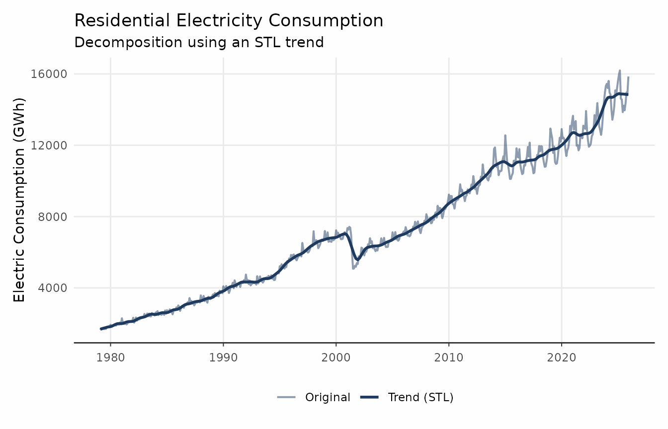
Multiple time series
trendseries makes it easy to compute trends across
several series at once. One or more grouping columns can be selected
through the group_cols argument. Note that this works best
for datasets in a “tidy” (long) format.
Here we use electricity, which records monthly
electricity consumption for three sectors (residential, commercial, and
industrial).
elec_sub_trend <- electricity |>
  dplyr::filter(date >= as.Date("1995-01-01")) |>
  augment_trends(
    date_col = "date",
    value_col = "value",
    group_cols = "name_series",
    methods = "stl"
  )

ggplot(elec_sub_trend, aes(date)) +
  geom_line(aes(y = value), alpha = 0.5, color = series_palette[[1]]) +
  geom_line(aes(y = trend_stl), color = series_palette[[1]]) +
  facet_wrap(vars(name_series), ncol = 1) +
  article_theme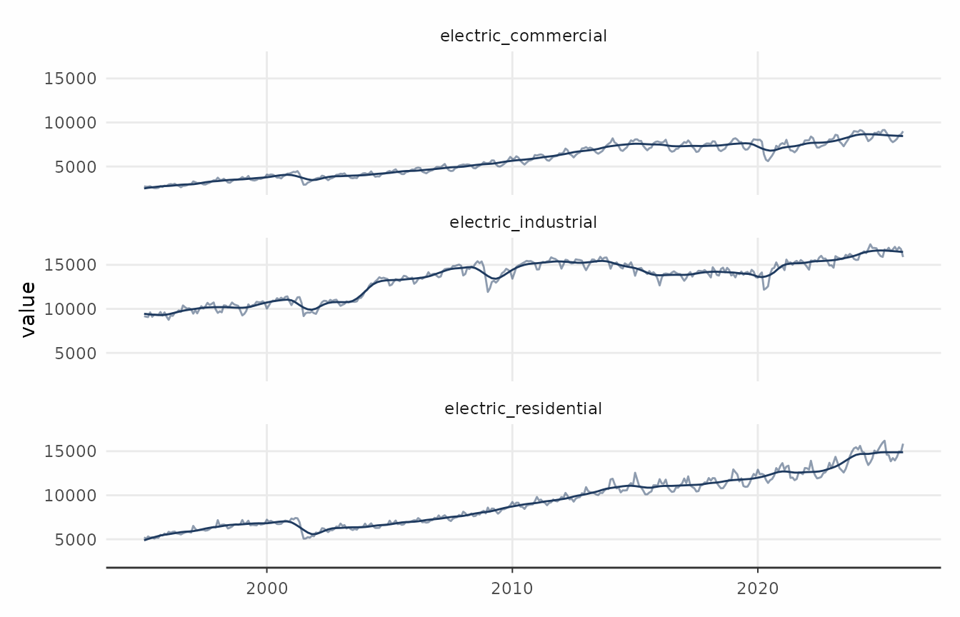
Multiple trend methods
trendseries also facilitates extracting trends with
different methods simultaneously. The next example uses a chained index
of retail sales of automotive fuel in the UK. The original data comes
from the UK Office for National Statistics.
ggplot(retail_autofuel, aes(date, value)) +
  geom_line(lwd = 0.7, color = series_palette[[1]]) +
  article_theme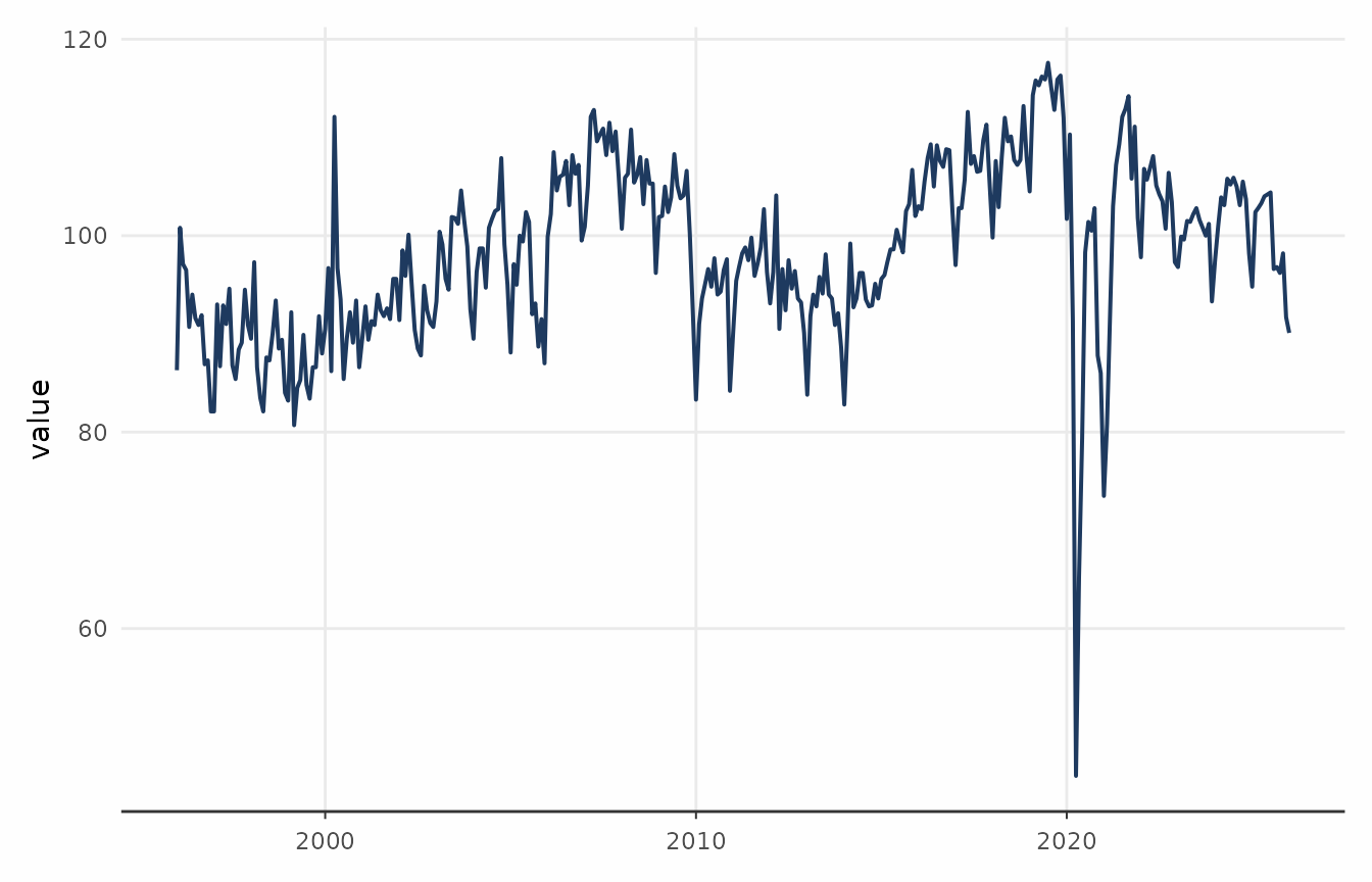
This example also highlights how augment_trends fits
neatly in a pipe workflow.
fuel_trends <- retail_autofuel |>
  filter(date >= as.Date("2012-01-01")) |>
  augment_trends(
    methods = c("stl", "hp", "loess")
  )

comparison_plot <- fuel_trends |>
  tidyr::pivot_longer(
    cols = c(value, starts_with("trend_")),
    names_to = "method",
  ) |>
  mutate(
    method = case_when(
      method == "value" ~ "Data (original)",
      method == "trend_hp" ~ "HP Filter",
      method == "trend_stl" ~ "STL",
      method == "trend_loess" ~ "LOESS"
    )
  )

ggplot(comparison_plot, aes(x = date, y = value, color = method)) +
  geom_line(linewidth = 0.7) +
  labs(
    title = "Comparing Different Trend Extraction Methods",
    subtitle = "Same data, different methods",
    x = "Date",
    y = "Retail Sales Index",
    color = "Method"
  ) +
  article_theme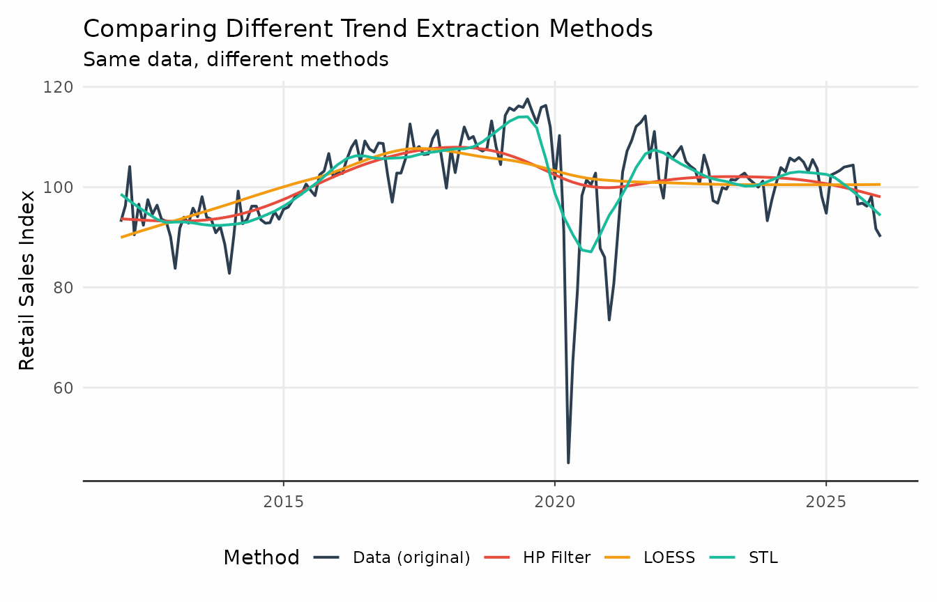
Finer control
Filter-extraction methods are spread across different packages and
thus use different conventions for parameter names.
trendseries tries to simplify this when possible. Methods
like moving averages and moving medians have a shared “window” argument
that defines the size of the rolling window. In the case of STL, the
“window” argument is inferred to be the seasonal windows
(i.e. s.window).
elec_trends <- electric |>
  rename(value = consumption) |>
  # window controls the s.window argument by default
  augment_trends(methods = "stl", window = 17) |>
  # Creates a 11-month moving median
  augment_trends(methods = "median", window = 11) |>
  # Creates a (centered) 5-month moving average
  augment_trends(methods = "ma", window = 5) |>
  # Creates a (centered) 2x12 moving average
  augment_trends(methods = "ma", window = 12)
comparison_plot <- elec_trends |>
  tidyr::pivot_longer(
    cols = c(value, starts_with("trend_")),
    names_to = "method",
  ) |>
  mutate(
    method = case_when(
      method == "value" ~ "Data (original)",
      method == "trend_median" ~ "Median",
      method == "trend_stl" ~ "STL",
      method == "trend_ma" ~ "MA (5)",
      method == "trend_ma_1" ~ "MA (2x12)"
    )
  ) |>
  filter(date >= as.Date("2018-01-01"))

ggplot(comparison_plot, aes(x = date, y = value, color = method)) +
  geom_line(linewidth = 0.7) +
  labs(
    title = "Comparing Different Trend Extraction Methods",
    subtitle = "Same data, different methods",
    x = "Date",
    y = "Retail Sales Index",
    color = "Method"
  ) +
  article_theme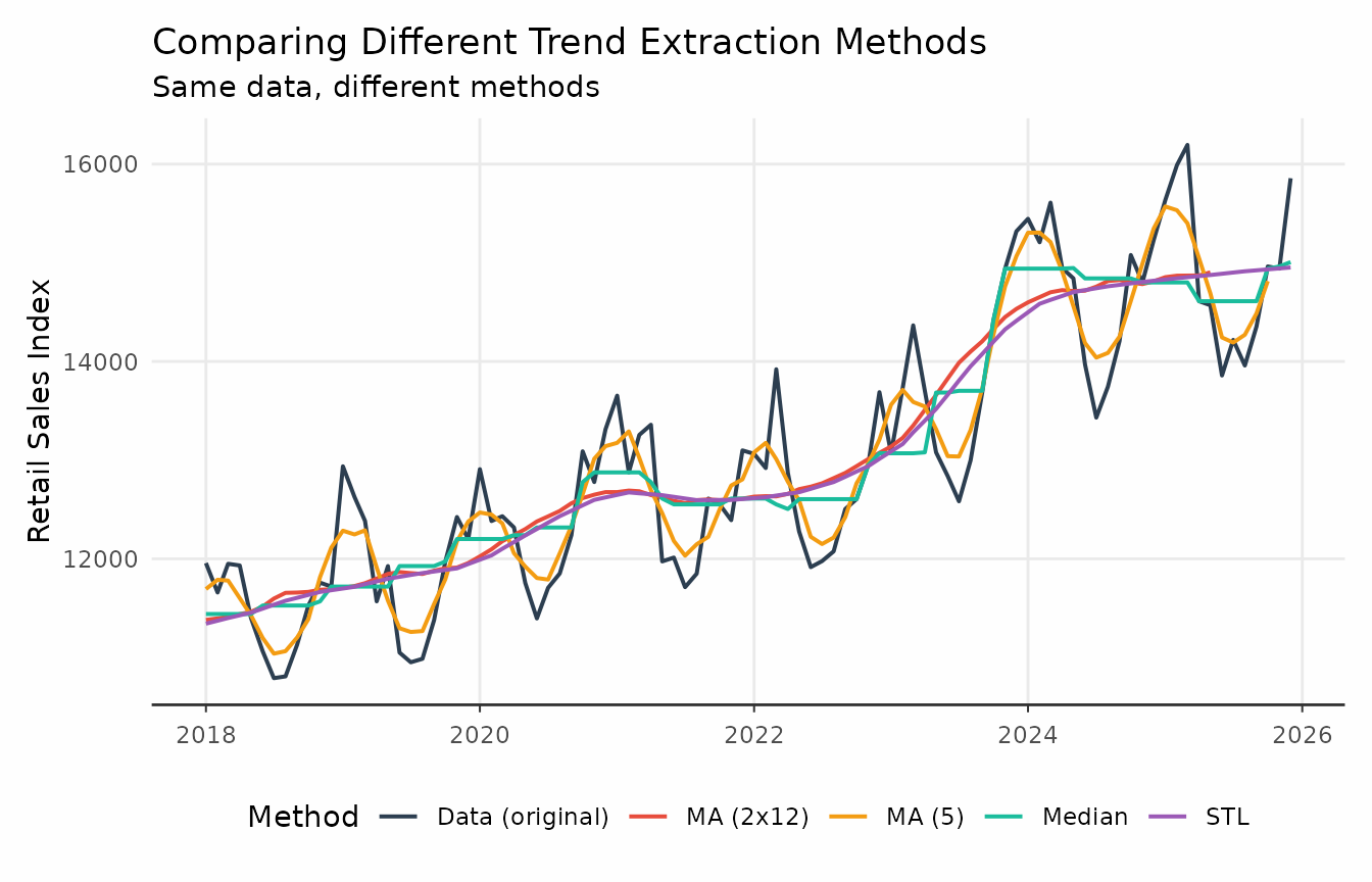
Note that trendseries simplifies trend extraction at the
cost of some precision. As noted above, stats::stl has both
a t.window and an s.window argument. The
window argument in trendseries controls
s.window by default.
How does augment_trends() compare to the traditional
workflow?
The typical workflow of estimating trends from a single series involves:
-
Converting pairs of
dateandnumericcolumns totsobjects. This usually means manually inputting bothfrequencyandstartparameters. -
Applying a filter function to the
tsobject. -
Extracting the trend. Since each filtering function
returns a different type of object the complexity varies. For example
stats::stlrequires.$time.series[, "trend"]and returns atsobject. -
Converting the
tsobject back to the originaldata.frame.
This can be cumbersome, especially when working with multiple series
or grouped data. Merging back the results with the original data can
also be error-prone due to misalignment of dates and additional
NA values introduced by some filters.
For instance, consider estimating a HP filter on
gdp_construction. The first step requires converting the
data frame to a ts object, manually inputting both
frequency and start parameters.
gdp_cons <- ts(
  gdp_construction$index,
  frequency = 4,
  start = c(1996, 1)
)

# Or, using lubridate to extract year and month
gdp_cons <- ts(
  gdp_construction$index,
  frequency = 4,
  start = c(
    lubridate::year(min(gdp_construction$date)),
    lubridate::quarter(min(gdp_construction$date))
  )
)
Then applying the HP filter using the mFilter
package.
gdp_trend_hp <- mFilter::hpfilter(gdp_cons, 1600)And finally, converting it back to a data.frame and
merging it with the original data.
# Convert back to data frame using tsbox
trend_df <- tsbox::ts_df(gdp_trend_hp$trend)
names(trend_df) <- c("date", "trend_hp")

# Join with original data
gdp_manual <- left_join(gdp_construction, trend_df, by = "date")
augment_trends() collapses all four steps above into a
single call:
gdp_auto <- augment_trends(
  gdp_construction,
  value_col = "index",
  methods = "hp"
)
What are the alternatives to trendseries?
The closest alternative to trendseries is the
tsibble/fable ecosystem, which provides a
model() function for applying models — including some trend
extraction methods — to grouped time series. Like
trendseries, these packages integrate well with
tidyverse tools and pipes.
However, fable was designed primarily for forecasting,
which means its trend extraction capabilities are more limited. They
also lack some popular methods commonly used by economists, such as the
HP filter and the Hamilton filter.
trendseries accepts ordinary data frames, while
augment_trends() and detrend_series() also
accept tsibbles with Date, yearmonth, or
yearquarter indices. These functions use the tsibble index
and key as the default date and grouping columns and preserve them in
the result. Other data-frame functions in trendseries do
not yet have this tsibble contract.
quarterly <- gdp_construction
quarterly$date <- tsibble::yearquarter(quarterly$date)
quarterly <- tsibble::as_tsibble(quarterly, index = date)
augment_trends(quarterly, value_col = "index", methods = "hp", .quiet = TRUE)
#> # A tsibble: 124 x 3 [1Q]
#>       date index trend_hp
#>      <qtr> <dbl>    <dbl>
#>  1 1995 Q1 100       101.
#>  2 1995 Q2 100       101.
#>  3 1995 Q3 100       102.
#>  4 1995 Q4 100       103.
#>  5 1996 Q1  97.8     103.
#>  6 1996 Q2 101.      104.
#>  7 1996 Q3 107.      104.
#>  8 1996 Q4 103.      105.
#>  9 1997 Q1 101.      106.
#> 10 1997 Q2 108.      106.
#> # ℹ 114 more rows
Summary
-
augment_trends()addstrend_{method}columns to a data frame or tsibble and is the core function oftrendseries;extract_trends()is the equivalent forts/xts/zooobjects. -
group_colsextracts trends for several series at once from tidy (long) data;methodsaccepts a vector to compare several methods side by side. - The unified parameters (
window,smoothing,band,align,params) give consistent, if slightly opinionated, control over method-specific options across all 20 supported methods. -
decompose_series()anddetrend_series()build on the same engine to return, respectively, the full trend/seasonal/remainder split and the deviation from trend — see the Decomposing Series and Detrending Series vignettes.