Plot a histogram chart
Usage
plot_histogram(
  data,
  x,
  color = "#FFFFFF",
  fill = NULL,
  pal_name = "qual_benvi",
  scale_name = "",
  zero = TRUE,
  bins = NULL,
  method = "fd",
  density = FALSE,
  facet = FALSE,
  ...
)
Arguments
- data
A data.frame type object
- x
<
data-masked> Indicates the numeric variable to be mapped- color
Color of the column border. Defaults to
"#FFFFFF"(white).- fill
Fill color for the columns. Either a color string (e.g.,
"blue","#021841") for a single static color, or a bare column name (without quotes) to map a grouping variable to fill color.- pal_name
String indicating the name of which palette to use when
fillis a variable mapping.- scale_name
String indicating fill legend title.
- zero
Logical indicating if a horizontal (y = 0) line should be drawn on the plot.
- bins
Number of bins. When specified, overrides
method.- method
Character specifying the binning algorithm. Must be one of:
"fd"(default),"FD","Scott","Sturges","Rice", or"sqrt". See Details for algorithm descriptions. Ignored whenbinsis specified.- density
Logical indicating if density should be plotted on y-axis.
- facet
<
data-masked> Optional variable to facet the graphics.- ...
Additional parameters to
facet_wrap()
Details
Binning Methods
The method parameter controls which algorithm is used to compute the optimal
bin width. Available methods:
"fd"or"FD"Freedman-Diaconis rule (default). Robust to outliers, uses IQR. Formula: \(2 * IQR / n^{1/3}\). Best for most distributions.
"Scott"Scott's rule. Uses standard deviation. Formula: \(3 * sd / n^{1/3}\). Works well for normal-like distributions.
"Sturges"Sturges' formula. Simple logarithmic rule. Formula: \(k = \lceil log_2(n) \rceil\) bins. Good for roughly normal data.
"Rice"Rice rule. Cube root based. Formula: \(k = \lceil 2n^{1/3} \rceil\) bins. General purpose rule.
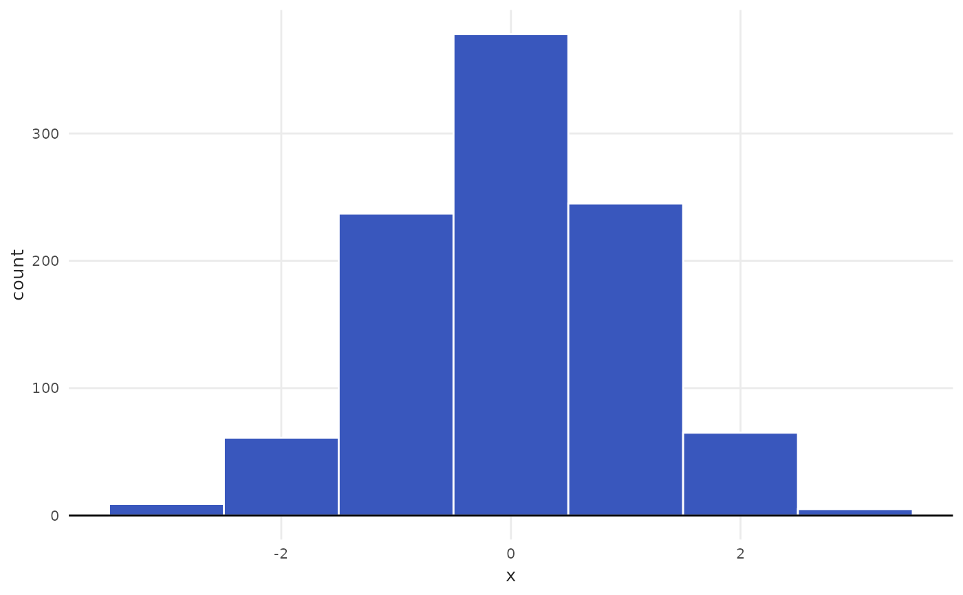
"sqrt"Square root rule. Formula: \(k = \lceil \sqrt{n} \rceil\) bins. Simple, tends to oversmooth.
When in doubt, use the default "fd" (Freedman-Diaconis), which is robust
and works well across different distributions.
Examples
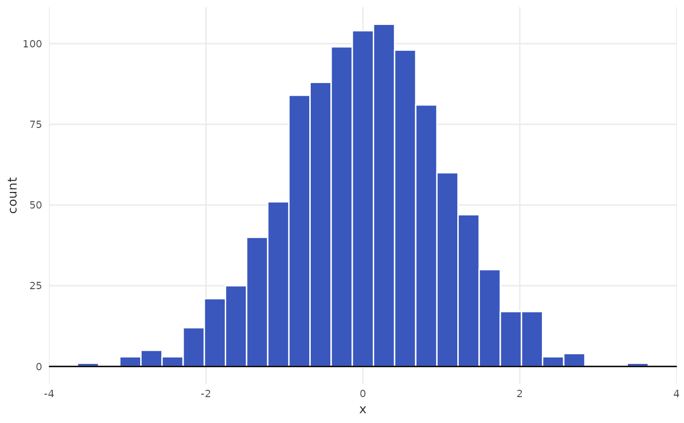
set.seed(5)
tbl <- data.frame(x = rnorm(n = 1000))
# Default parameters use Freedman-Diaconis
plot_histogram(data = tbl, x = x)
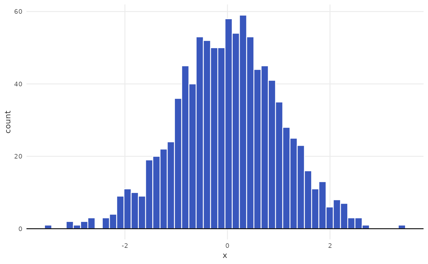
 # Use bins to manually choose number of bins
plot_histogram(data = tbl, x = x, bins = 50)
# Use bins to manually choose number of bins
plot_histogram(data = tbl, x = x, bins = 50)
 # Example of alternative methods: square root and Rice
plot_histogram(data = tbl, x = x, method = "sqrt")
# Example of alternative methods: square root and Rice
plot_histogram(data = tbl, x = x, method = "sqrt")
 plot_histogram(data = tbl, x = x, method = "Rice")
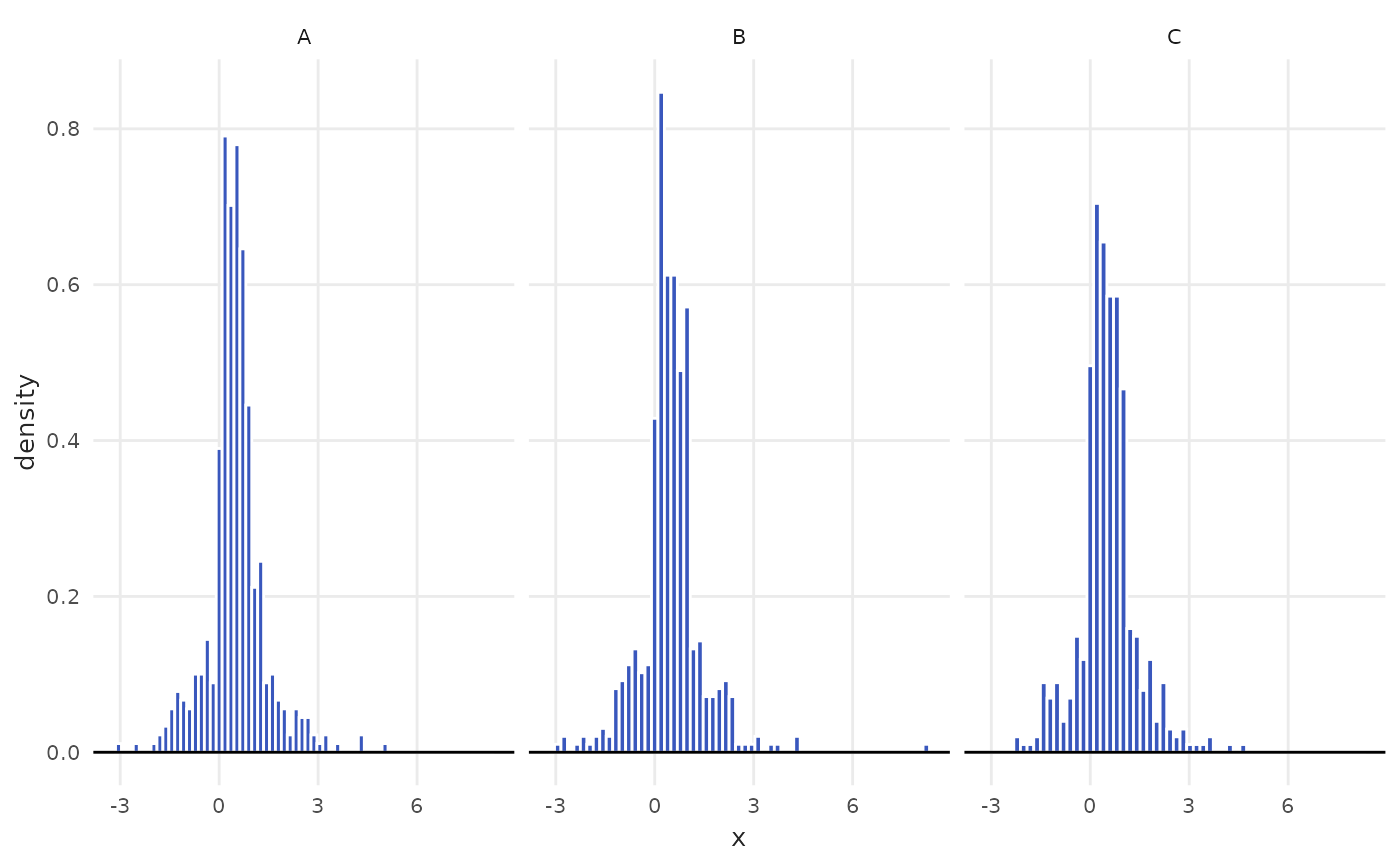
 # Facet by rooms category
spo <- subset(iqaiw, name_muni == "S\u00e3o Paulo" & rooms != "Total")
plot_histogram(data = spo, x = index, facet = rooms)
# Facet by rooms category
spo <- subset(iqaiw, name_muni == "S\u00e3o Paulo" & rooms != "Total")
plot_histogram(data = spo, x = index, facet = rooms)