Column plot with text labels
Usage
plot_column_label(
  data,
  x,
  y,
  label,
  fill,
  variable,
  zero = TRUE,
  flip = TRUE,
  fill_guide = "none",
  palette = "qual_9",
  text_color = "white",
  text_family = "sans",
  text_size = 4,
  scale_name = "",
  scale_label = waiver()
)
Arguments
- data
A data.frame type object
- x
<
data-masked> Variable to be mapped in the x-axis.- y
<
data-masked> Variable to be mapped in the y-axis.- label
<
data-masked> Text label to mapped onto the column. Defaults to y variable.- fill
Color for the columns. Should only be used if
variableis missing.- variable
<
data-masked> Variable to be used as grouping for the color groups. Should only be used iffillis missing.- zero
Logical indicating whether a horizontal line crossing the y = 0 axis should be plotted.
- flip
Logical indicating if plot should be flipped
- fill_guide
Optional indicating if fill guide should be suppressed.
- palette
String indicating the name of which palette to use.
- text_color
Color of the text label. Default is
"gray20".- text_family
Font of the text label. Default is
"Poppins".- text_size
Size of the text label. Default is
3.- scale_name
String indicating fill legend title.
- scale_label
String indicating fill legend labels.
Examples
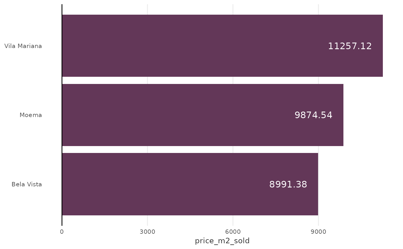
df <- data.frame(
  house_region = c("Vila Mariana", "Moema", "Bela Vista"),
  price_m2_sold = c(11257.12, 9874.54, 8991.38)
)

plot_column_label(df, x = house_region, y = price_m2_sold, fill = "#633758")