claudeplot brings the visual language of Anthropic and Claude to ggplot2: a publication-ready theme, color palettes from Anthropic’s brand and its data-visualization style, color/fill scales, and palette helpers.
The theme
theme_claude() gives a light background, light horizontal grid lines, strong axis lines, a bold Poppins title, and a serif Lora subtitle.
ggplot(mtcars, aes(wt, mpg, color = factor(cyl))) +
  geom_point(size = 3) +
  scale_color_claude_d() +
  labs(
    title = "Fuel efficiency by weight",
    subtitle = "Heavier cars travel fewer miles per gallon",
    x = "Weight (1000 lbs)",
    y = "Miles per gallon",
    color = "Cylinders"
  ) +
  theme_claude()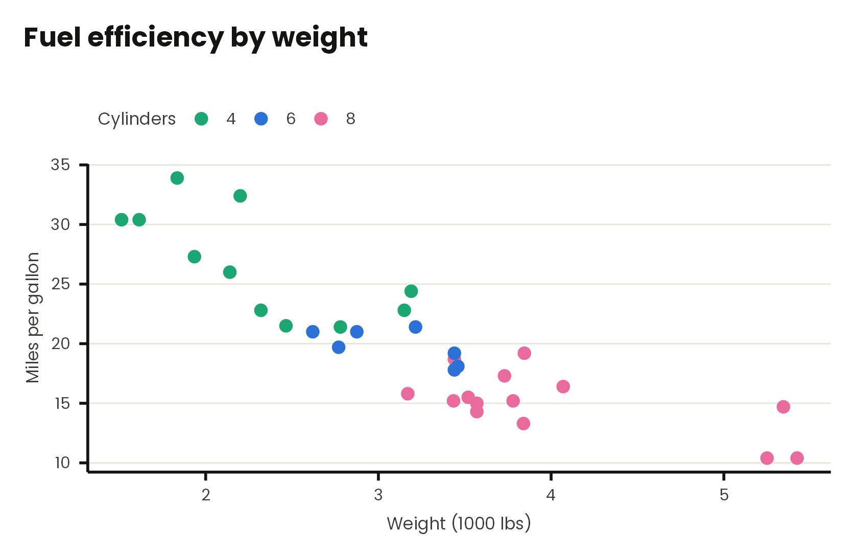
You can control the grid ("y", "x", "xy", "none"), toggle the axis lines, and switch to Anthropic’s warm off-white background:
ggplot(mpg, aes(displ, hwy)) +
  geom_point(color = claude_colors[["viz_blue"]]) +
  labs(title = "Engine size vs. highway mileage") +
  theme_claude(grid = "xy", background = "cloud")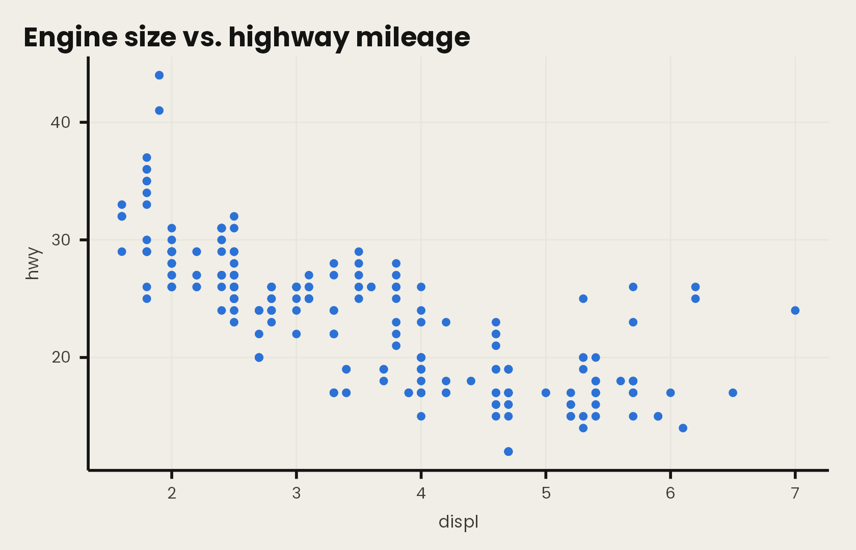
Color scales
Every scale comes in discrete (_d) and continuous (_c) forms, for both color/colour and fill.
df <- data.frame(
  model = c("Opus 4.6", "Opus 4.7", "Opus 4.8", "Fable 5"),
  score = c(58.6, 69.2, 80.3, 88.4)
)

ggplot(df, aes(model, score, fill = model)) +
  geom_col(width = 0.7) +
  geom_text(aes(label = score), vjust = -0.5, fontface = "bold") +
  scale_fill_claude_d() +
  scale_y_continuous(
    limits = c(0, 100),
    expand = expansion(mult = c(0, 0.05))
  ) +
  labs(
    title = "Agentic coding",
    subtitle = "SWE-Bench Pro (%)",
    x = NULL,
    y = NULL
  ) +
  theme_claude() +
  theme(legend.position = "none")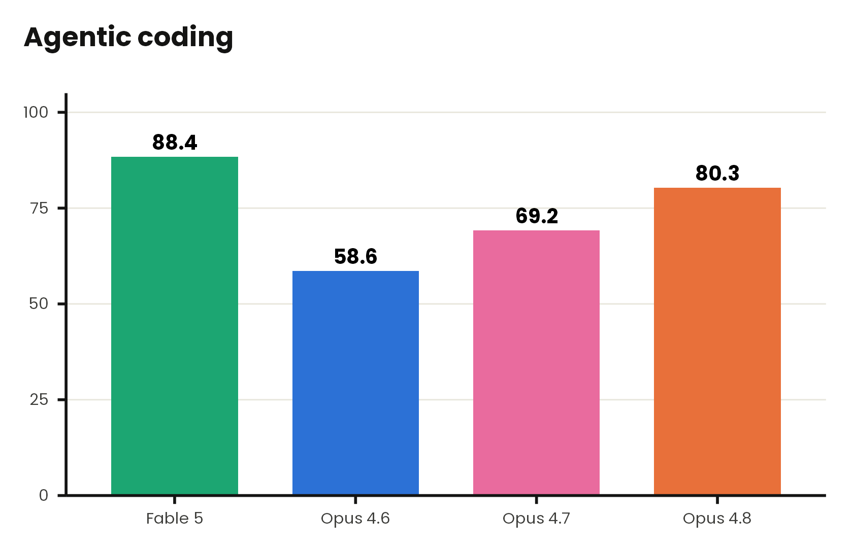
Rounded bars
Anthropic’s benchmark charts often use bars with softly rounded tops. The gground package pairs nicely with claudeplot: swap geom_col() for geom_round_col() for the same look.
library(gground)

ggplot(df, aes(model, score, fill = model)) +
  geom_round_col(width = 0.7, radius = 0.3) +
  geom_text(aes(label = score), vjust = -0.5, fontface = "bold") +
  scale_fill_claude_d() +
  scale_y_continuous(
    limits = c(0, 100),
    expand = expansion(mult = c(0, 0.05))
  ) +
  labs(
    title = "Agentic coding",
    subtitle = "SWE-Bench Pro (%)",
    x = NULL,
    y = NULL
  ) +
  theme_claude() +
  theme(legend.position = "none")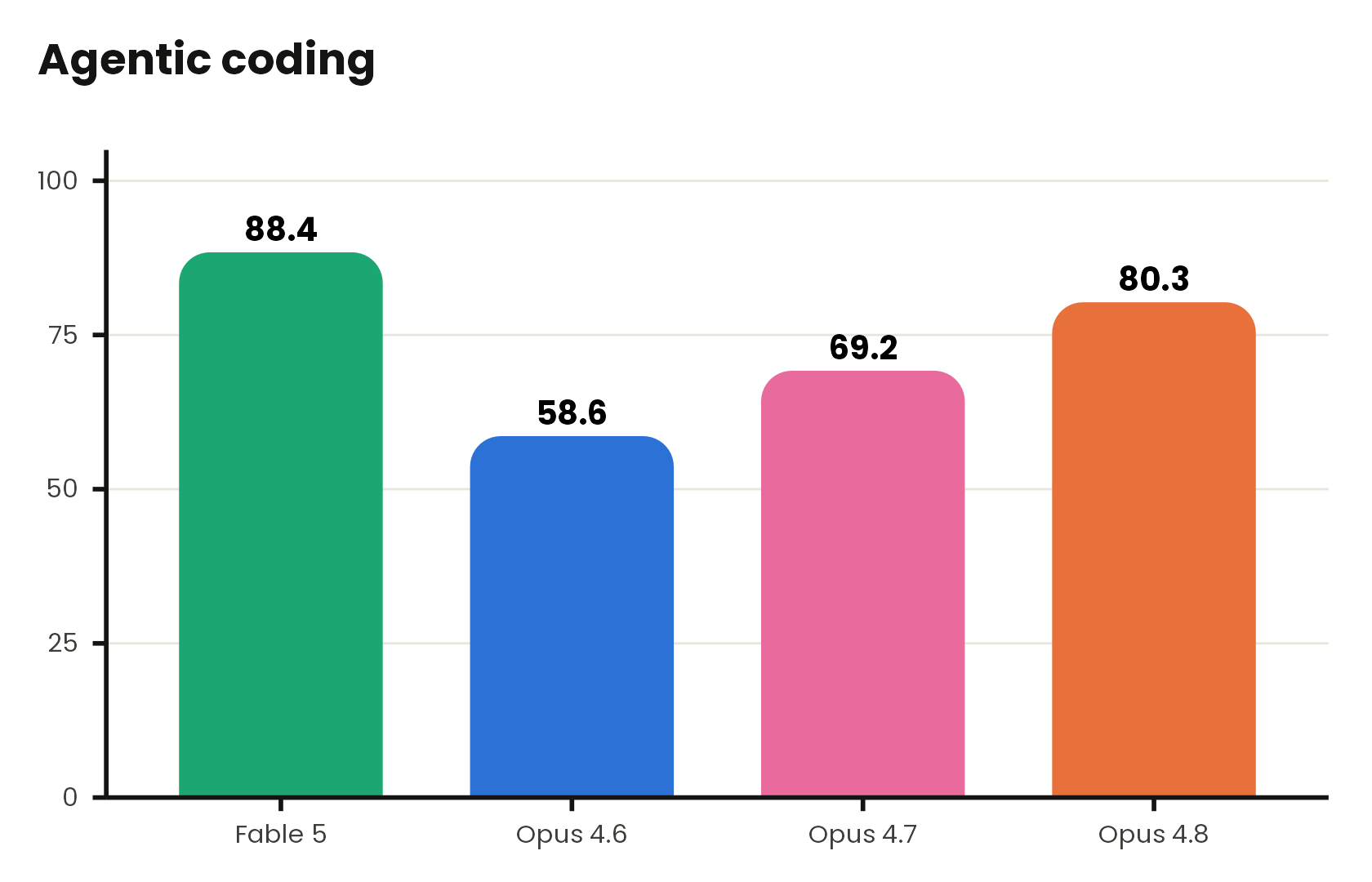
Continuous scales interpolate the sequential and diverging palettes:
ggplot(faithfuld, aes(waiting, eruptions, fill = density)) +
  geom_raster() +
  scale_fill_claude_c(palette = "oranges") +
  labs(title = "Old Faithful eruptions") +
  theme_claude(grid = "none")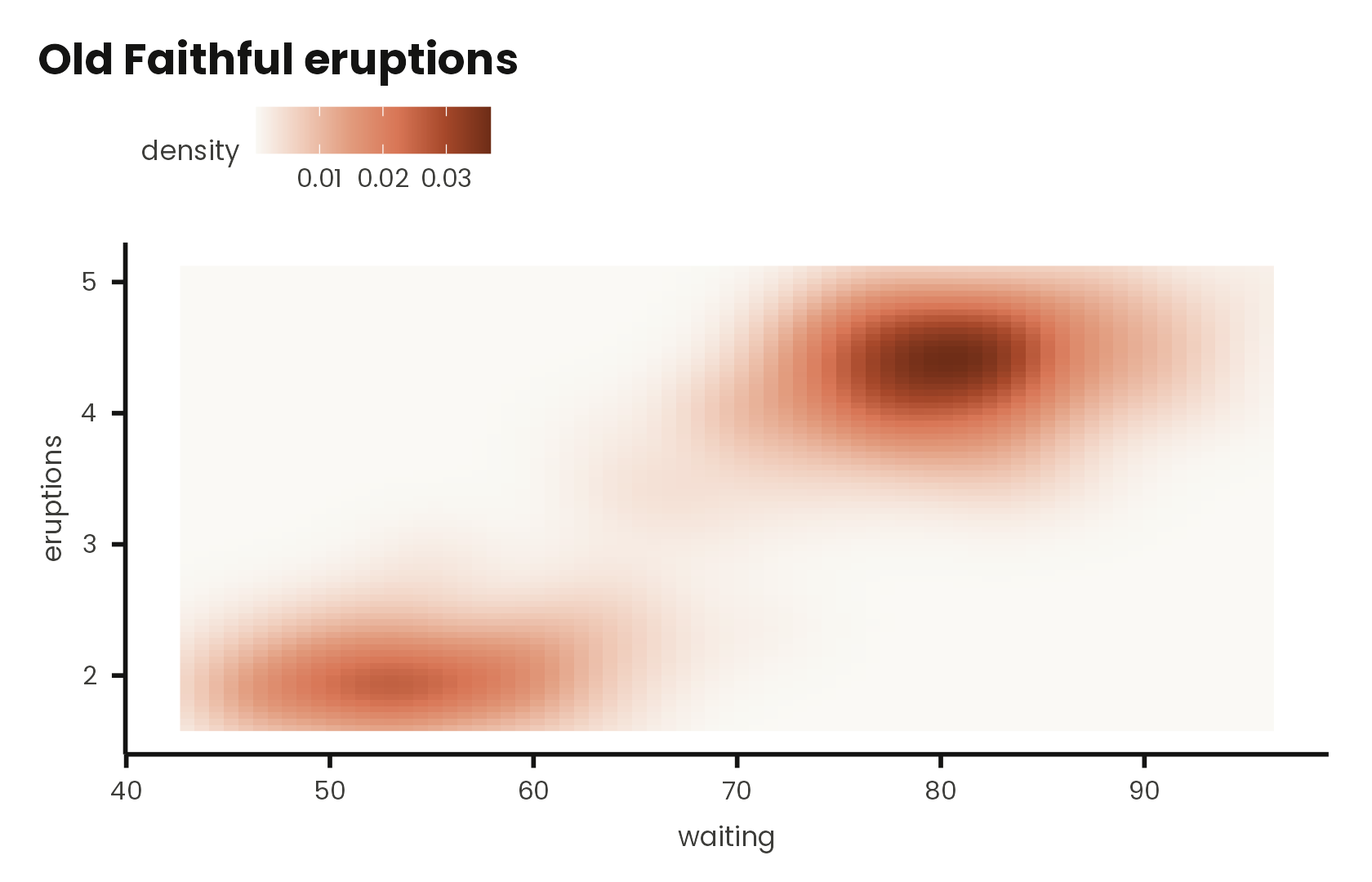
Palettes
List the palettes, draw one, or draw them all:
claude_palette_names()
#>  [1] "claude"       "brand"        "warm"         "cool"         "editorial"
#>  [6] "ochre_blue"   "neutral"      "oranges"      "blues"        "greens"
#> [11] "grays"        "orange_blue"  "green_orange" "spectral"
show_claude_palette("spectral", n = 9, type = "continuous")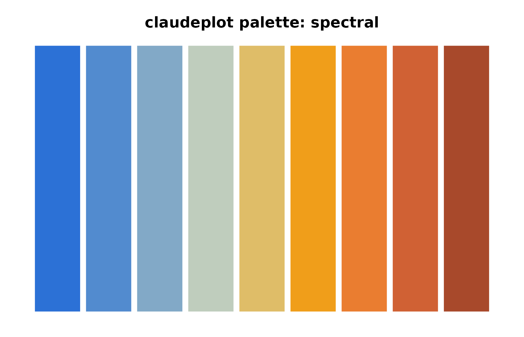
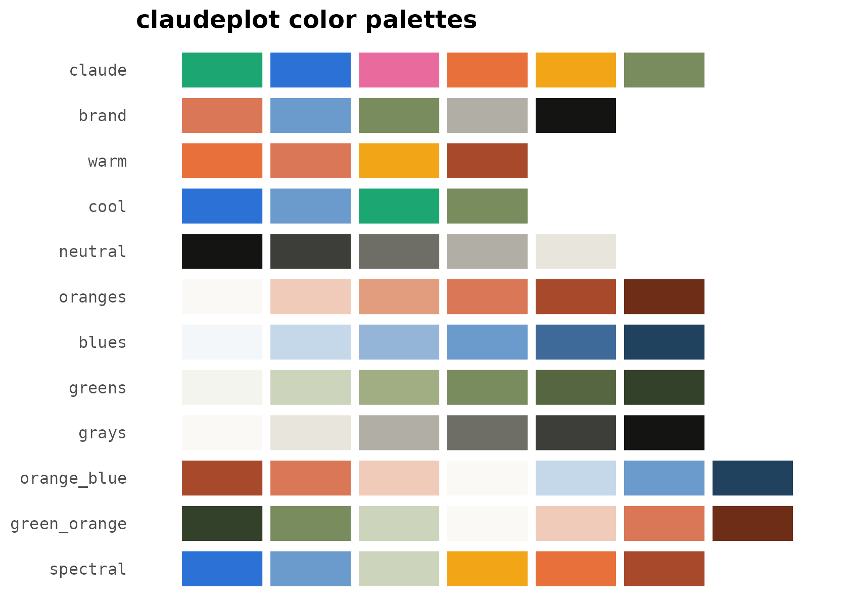
The qualitative families are claude (the vivid benchmark palette), brand (muted Anthropic accents), warm, cool, and neutral. Sequential families are oranges, blues, greens, and grays; diverging families are orange_blue, green_orange, and spectral.
Fonts
claudeplot bundles Poppins and Lora and registers them with systemfonts on load. They render on ragg and svglite devices; check availability with:
If a font is unavailable, theme_claude() falls back to generic "sans" and "serif" families, so plots always render.